1. GLOSSARY
Network: a set of gateways (one active and another one optional for redundancy purposes) and the devices connected to them.
Device: a device containing elements, actuators, and operational parameters. This device sends its data to the Kunak Cloud platform using cellular, ethernet or radio gateways (Kunak LoRa).
Gateway: a device, with ethernet or cellular connection, placed at the edge of a network and responsible for connecting other devices to the Kunak Cloud platform.
Location: virtual site created by the user to analyse location data without taking into account the devices that have passed through the place. Allows you to manage your data by locations by assigning devices to specific spots.
Sensor: a measurable part of a device. For example, an analog or digital sensor or the device’s battery or signal levels.
Actuator: a part of the device that allows executing an actuation on a device, for example opening a valve.
Operational parameter: additional attribute with a value that can affect the operation of a device. This value can be of different types: number (integer or decimal), text or binary. Operational parameters can belong to a Kunak device or an external one connected to the Kunak device through communication protocols such as Modbus.
Optional parameter: additional informative parameters (key-value) that users can manage the way they want.
Sending period: time interval between two consecutive communications of a device. Devices store samples of the connected sensors (sampling/reading period) and sends them together every sending period.
Reading/sampling period: time interval between samples taken by a sensor.
Max and min threshold: sensors’ measurements values that when are exceeded under certain persistence conditions, an action will be triggered (register event, send emails, etc.).
Persistence: number of consecutive events that must occur before a warning/alarm/heartbeat will be triggered. With the inclusion of persistence, the “notifications spam” is prevented.
Coefficients: values used as coefficients (X0, X1, X2) of the polynomial used to
approximate the response curve of a sensor ![]() .
.
Heartbeat: checking sequence that the Kunak Cloud platform makes with every device to corroborate whether is active or not. Registered once when the device has not connected within the estimated time interval (last connection + sending period + network offset). Once a device connects again, its heartbeat alarm is disabled.
Warning: event generated by the devices when the sensor threshold is reached. It is registered when as many consecutive reads as the configured persistence exceed the configured thresholds. Once the samples no longer exceed the thresholds, the warning is automatically closed by the device.
Alarm: event generated by Kunak Cloud to help with the operation of the devices. Alarms are used for example to inform of heartbeat, battery drain, broken sensors, lack of data, etc.
Active warning/alarm: warning/alarm that is active at the current time. Active warnings cannot be manually confirmed (the platform will automatically deactivate them) while alarms can be confirmed bu the user in the dedicated section of Kunak Cloud.
Unconfirmed warning/alarm: a deactivated warning/alarm the user has not confirmed yet.
Confirmed warning/alarm: a deactivated alarm the user has already confirmed.
Preheating: required time by the sensor to meet the right conditions to start working properly.
Scheduled actuation: an actuation with a defined start date and an optional end date.
Periodic actuation: an actuation that will be repeated periodically.
Datapoints: the value of a sensor in a certain time stored in the Kunak Cloud platform. Datapoints consist of the following fields: {device id, element id, value, timestamp}.
Internal sensors: Kunak devices usually come with a few internal sensors (Battery, Temp, Signal, GNSS Lat, GNSS Lon, GNSS Alt) whose tags are reserved and cannot be used by other elements/sensors owned or connected by the user.
2. INTRODUCTION
It offers all the benefits and potential of its features integrated into one unique account. The user can access all available services (web, web services, app, and email alerts) through this unique account.
Thanks to our bidirectional software, Kunak Cloud offers professionals a new way to handle remote configurations setting, alarms management, calibration, and field operations. Kunak Cloud is a flexible modular software designed for easy user account management, easy network operation, easy data validation, easy analysis, and reporting.
2.1 System requirements
· Internet Connection/Connectivity: a high-speed internet connection (>10 Mb), especially useful when charting or exporting large amount of data.
· Supported browsers: Firefox, Chrome, Edge and Opera.
· Operating system: any OS capable of running the latest versions of the supported browsers.
2.2 Obtain an account
The first thing that is required to access the platform is an account. Upon purchasing the first Kunak licence, the new customer will receive an email with a username and a default password. This credentials (username and password) will be needed to authenticate every time a service demands it.
It is recommended to change the default password after logging into Kunak Cloud’s web for the first time. This process will be explained afterwards in this document, in the 3.9.1 User Settings section.
In case any Kunak device has been purchased and the customer account has not been set yet, please contact us at [email protected].
2.3 Access to the platform
Kunak Cloud’s web can be accessed by browsing to www.kunakcloud.com.
2.4 Architecture

Figure 1 – Architecture
2.5 Data Storage
The data of the devices are stored on the device until it sends them to the cloud server. Once the data is sent to the cloud, it can be consulted for up to one year. After a year, the data is not erased, but is muved to another database that can not be access from Kunak Cloud platform. If you need older data than one year, please contact [email protected] and we will tell you how you can recover your data.
2.6 Profiles and Packages
Kunak Cloud is composed of different types of account profiles and device packages to meet the needs of each case.

Figure 2 – Accounts – devices hierarchy
2.6.1 Account Profiles
The accounts are organized in a hierarchical way. To begin with, an administrator account is required.
![]() The permission may vary depending on the contracted packages of the
devices
The permission may vary depending on the contracted packages of the
devices
Each profile of account can access to different parts of the cloud:
· Viewer: Always keep on track with diagnosis, operation and maintenance works; and have access to consult validated data, custom analytics and reports. Basic account with access to consult validated data, custom analytics, logbook and reports.
· Expert: Easily manage the network; configure, operate, calibrate and maintain the devices as well as validate and analyse data and create reports.
· Admin: The Admin account profile has the same functionalities as the Expert account and can also manage devices and lower level accounts. There can only be one administrator account for organization.
· Custom: Account with special permissions agreed with the customer..The content of the following section “Device Packages” does not apply to custom accounts.
2.6.2 Device Packages
Regarding the software functionalities associated with the devices, there is a basic package needed to connect a device to Kunak Cloud (Starter package) and additional packages to add more features (Operational and Analytics packages). Packages can be different for each device and account. The Admin account can manage the packages of the devices, so that each of its administrated users could have the same packages as the Admin account or less (never more), depending on the needs:
· Starter (S): is the main package, always supplied with a Kunak device that is connected to Kunak Cloud. Dashboard to overview the status of your devices and sensors. Easily visualize your realtime data, check temporal graphs and get basic statistics. Obtain reliable data thanks to automatic data flagging.
o Check your devices on a map, their operational status, and last measurements.
o Standard data visualisation, hourly/daily average calculations and basic statistics to show in a fast way all the data measured by your devices.
o Export your data into CSV or TXT fi les.
o Air Quality Index (AQI) tool according to different scales: EU, US EPA, Spain, India, etc.
o Automatic pre-invalidation of the data under devices or sensors malfunctions.
o Remote confi guration of warnings for exceeding thresholds.
o Bidirectional communication for remote confi guration of the devices and over the air firmware update.
· Operation (O): Assure the well-functioning of your network and get the best data accuracy thanks to the embedded automatic supervision algorithms. Confirm operation alarms (sensor malfunctions, devices problems...) and consult the online suggestions to troubleshoot the detected issues while controlling all the actions carried out in your devices through the CMMS tool.
o Automatic errors and anomalies detection in the devices, sensors, and data with immediate notification and proposing tips to solve the issue.
o Detect gas and particulate sensors de-calibration. Calibrate your gas and particle sensors remotely thanks to the Calibration Tool.
o Computerized Maintenance Management System (CMMS) to facilitate device maintenance, to register any maintenance work, to upload photos and documents, confi guration history, activity journal, etc.
o Manage your air quality data by locations assigning devices to specific spots.
· Analytics (A): Get the most out of your data by validating your measurements and using the advanced analytics of the OpenAir suite. Detect source emissions and hotspots thanks to the tools which show advanced wind graphs and heatmaps on the map. Create customized reports and export or share them with your clients or stakeholders online.
o Simple manual data Validation Tool to clean data sets and perform advanced analysis with reliable data.
o Advanced Analytics Tool from Open Air suite to facilitate data analysis, including calculation of basic statistics, AQI calendar plots and pollutant concentration calendars, pollutant time plots, temporal variation, wind plots and many more.
o Integration of other data sources in real-time or by file insertion.
o Easy tool to create your AQ reports automatically of a device and/or an entire network.
o Heatmaps to identify hotspots over a zone.
o Time-varying heatmaps to know the evolution of hotspots over time.
o Pollution sources detection using pollution roses and polar plots directly on the map.
o Particle size analysis tool that includes size distribution graphs by mass and by counts.
· Custom (C): Custom permissions for devices agreed with the customer in advance.
2.6.3 Summary of Profiles and Packages
|
USER ACCOUNTS |
ADMIN |
EXPERT |
VIEWER |
|
|
Confidentiality and Ownership of data guaranteed by EULA agreement (consult) |
✓ |
✓ |
✓ |
|
|
ISO 27001 approved cloud data centers (AWS) |
✓ |
✓ |
✓ |
|
|
Infrastructure monitored and protected 24/7 |
✓ |
✓ |
✓ |
|
|
TLS Secured Data |
✓ |
✓ |
✓ |
|
|
HTTPS: Secure website with 128-bit TLS encryption |
✓ |
✓ |
✓ |
|
|
User defined passwords |
✓ |
✓ |
✓ |
|
|
Choose your units, e.g. gas concentration in ppm or μgm-3 |
✓ |
✓ |
✓ |
|
|
Set your time zone and language |
✓ |
✓ |
✓ |
|
|
Access to activity, services and news notifications Toolbar |
✓ |
✓ |
✓ |
|
|
Notifications of thresholds, alarms,… by emails |
✓ |
✓ |
✓ |
|
|
FAQs, knowledge base, e-mail support with replying asap. |
✓ |
✓ |
✓ |
|
|
API call limit / month |
10.000 calls |
10.000 calls |
10.000 calls |
|
|
API call additional packages |
50.000 calls / year / package |
50.000 calls / year / package |
50.000 calls / year / package |
|
|
Android App with your user/passwordr |
✓ |
✓ |
✓ |
|
|
Link devices to users and manage the permission to every user individually |
✓ |
- |
- |
|
|
Create and edit Organizations and new user accounts |
✓ |
- |
- |
|
|
Acess to Treeview to manage all of your organizations instruments in one screen |
✓ |
- |
- |
|
|
Access to the Action Log for every account |
✓ |
- |
- |
|
|
Organizations hierarchy, Clients and users management tools (permissions) |
✓ |
- |
- |
|
|
Billing Management |
✓ |
- |
- |
|
|
DEVICE PACKAGES |
STARTER PACKAGE |
ADMIN |
EXPERT |
VIEWER |
|
Check the status of your devices |
✓ |
✓ |
✓ |
|
|
View basic diagnostic information of the devices |
✓ |
✓ |
✓ |
|
|
Follow the actions taking place in your devices (view O&M logbook) |
✓ |
✓ |
✓ |
|
|
Acess to traceability info and receive notifications when the sensor cartridge ends the lifespan |
✓ |
✓ |
✓ |
|
|
Automatic data-flagging (pre-invalidation of outliers data) |
✓ |
✓ |
✓ |
|
|
Dashboard View |
✓ |
✓ |
✓ |
|
|
Map view |
✓ |
✓ |
✓ |
|
|
Multiparametric and Multidevice Charts |
✓ |
✓ |
✓ |
|
|
Table View |
✓ |
✓ |
✓ |
|
|
View data by locations |
✓ |
✓ |
✓ |
|
|
Donwload Data (csv, txt) |
✓ |
✓ |
✓ |
|
|
Automatic averages calculations according to AQ standards |
✓ |
✓ |
✓ |
|
|
Access to interactive AQI tool (EU and EPA. Others under request) |
✓ |
✓ |
✓ |
|
|
View your warnings |
✓ |
✓ |
✓ |
|
|
Statistics View (Max, Min, Mean, SD included for every parameter) |
✓ |
✓ |
✓ |
|
|
Access to custom Reports published |
✓ |
✓ |
✓ |
|
|
Realtime local storage serves as backup to resend once the unit is again online |
✓ |
✓ |
✓ |
|
|
Access to device configuration (sampling and sendig periods, specific features…) |
✓ |
✓ |
- |
|
|
Set Warnings, thresholds and receive notifications by email |
✓ |
✓ |
- |
|
|
Check Warnings |
✓ |
✓ |
- |
|
|
Data cloud Storage time limit |
1 year |
1 year |
1 year |
|
|
OPERATION PACKAGE |
ADMIN |
EXPERT |
VIEWER |
|
|
Gas Calibration Tool: baseline and span adjustment remotely |
✓ |
✓ |
- |
|
|
Particle Sensor Calibration Tool: calibrate your devices remotely |
✓ |
✓ |
- |
|
|
Automatic health supervision alarms (broken sensor, out of battery, lack of data…) |
✓ |
✓ |
- |
|
|
Register manually every intervention on the device (Upload photos, pdf, documents) |
✓ |
✓ |
- |
|
|
Edit the activity journal and access to the Manual Actions Log |
✓ |
✓ |
- |
|
|
Access to the Configuration History |
✓ |
✓ |
- |
|
|
Activate the automatic invalidation of data during interventions & maintenance |
✓ |
✓ |
- |
|
|
Manage your AQ data by locations assigning devices to specific spots |
✓ |
✓ |
- |
|
|
Share locations with other users |
✓ |
✓ |
- |
|
|
ANALYTICS PACKAGE |
ADMIN |
EXPERT |
VIEWER |
|
|
Pollution roses and polar plots over the map |
✓ |
✓ |
✓ |
|
|
Heatmap to detect hotspots over an area |
✓ |
✓ |
✓ |
|
|
Time-varying heatmaps to know evolution of hotspots over time |
✓ |
✓ |
✓ |
|
|
Particulate size analysis tool (particle size distribution by counts and by mass) |
✓ |
✓ |
✓ |
|
|
Openair Suite for Advanced Analytics |
✓ |
✓ |
- |
|
|
Data Validation Tool for manual data flagging |
✓ |
✓ |
- |
|
|
Access to Report Tool for Networks |
✓ |
✓ |
- |
|
|
Access to Report Tool for Devices |
✓ |
✓ |
- |
Table 2 – Summary of accounts profiles and devices packages
3. KUNAK CLOUD SECTIONS
3.1 Home and Navigation Bar
“Home” is the landing page in https://www.kunakcloud.com for logged in users. It offers state information about the devices, their location on a map, and the last reads and thresholds of every sensor. The following image shows how the home page looks like:
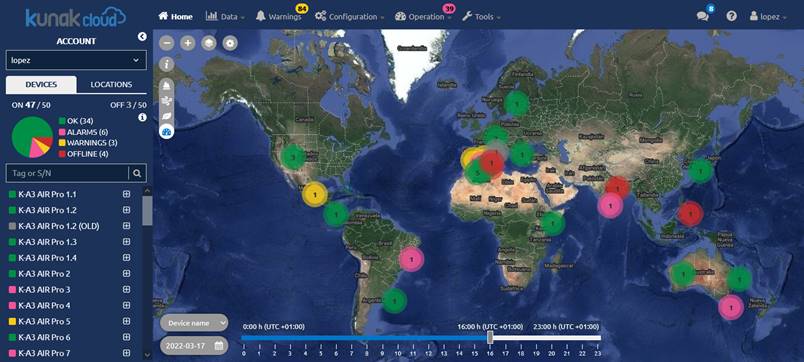
Figure 3 – Home section
The browsing structure of Kunak Cloud is very simple and it consists of:
· Navigation bar: in the upper part of the page there is a navigation bar with all the available menus (Home, Warnings, Data, Configuration, Management and Tools). This bar is visible all the time (the same as the network column), being very easy to choose among all the different menus on the web. Some options of the navigation bar can unfold a submenu which is visible below the navigation bar.
·
Device list:
placed on the left, it will be visible all the time, in all sections of the
web. It is useful to check all your devices at a glance, with information of
their state (location, coverage, battery, last and next estimated connection,
and unconfirmed and active warnings). It can be expanded/collapsed by clicking
on ![]()
![]()
· Main content: this is the place where the different sections will be loaded.
The distribution of the different parts of Kunak Cloud is displayed below:

![]()
Figure 4 – Platform general structure
3.1.1 Navigation Bar
Kunak Cloud has a responsive top navigation bar that allows the user browsing to the different offered features.
![]()
Figure 5 – Navigation bat: wide view

Figure 6 – Navigation bar: narrow view
3.1.2 Device and Location List
The states of a device or location can be:
·
[-1] ![]() Not devices (White): Only for
locations. No devices assigned to the location.
Not devices (White): Only for
locations. No devices assigned to the location.
·
[0] ![]() OK
(Green): Device connected without alarms or warnings. The device has
connected during the estimated time interval (last connection + sending period
+ wireless communications offset).
OK
(Green): Device connected without alarms or warnings. The device has
connected during the estimated time interval (last connection + sending period
+ wireless communications offset).
·
[1] ![]() Off (Grey): Device switched off
correctly by the user or heartbeat not active.
Off (Grey): Device switched off
correctly by the user or heartbeat not active.
·
[2] ![]() Warning
(Yellow): The device is connected but has warnings that must be attended
due to a configured threshold being exceeded.
Warning
(Yellow): The device is connected but has warnings that must be attended
due to a configured threshold being exceeded.
·
[3] ![]() Offline
(Red): The connection with the device was lost. Only works when the
device’s heartbeat is active and when the device does not connect within the
estimated communication window (last connection date + [sending period x
persistence] + communications offset). This could be caused by coverage
(unreachable or too slow network) or device problems.
Offline
(Red): The connection with the device was lost. Only works when the
device’s heartbeat is active and when the device does not connect within the
estimated communication window (last connection date + [sending period x
persistence] + communications offset). This could be caused by coverage
(unreachable or too slow network) or device problems.
·
[4] ![]() Alarms (Pink): Device connected but has operation alarms to
be attended.
Alarms (Pink): Device connected but has operation alarms to
be attended.
Since locations group the information of several devices that may be assigned to them, locations state is represented by the most critical state of the devices assigned to it.
The left bar its divided into sections:
Figure 7 – Device list sections
· User filter: it allows filtering the devices visible by a client/user.
· Devices / Location selector: change the cloud view between devices or locations.
· Summary: pie chart showing the devices grouped by state. It is possible to filter devices by clicking on the legend and only the devices in the selected state will be shown on the “Device list” and on the map.
· Search: to easily find your device or location by S/N or Tag.
·
Device / Location list: an interactive list containing the devices registered in this
Kunak Cloud account. Click on the ![]() icon to
expand the detailed state (battery, signal, temperature, alarms) of a device.
Click on the “-” icon to collapse the detailed state of a device. Click on the
tag to select this device in the different sections (the device will preload in
the corresponding device selectors).
icon to
expand the detailed state (battery, signal, temperature, alarms) of a device.
Click on the “-” icon to collapse the detailed state of a device. Click on the
tag to select this device in the different sections (the device will preload in
the corresponding device selectors).
3.1.3 Dashboard Main Content
Space where the main content will appear, such as the map, configurations, graphics,... After the login, a map of all the devices with their status is shown.

Figure 8 – Dashboard main content map
At the map, you can find:
· Zoom: it can be done with the mouse scroll or with the buttons
![]()
Figure 9 – Dashboard zoom buttons
· Map view: if you don’t like the satellite map view, can be changed to a basic one
![]()

Figure 10 – Dashboard map view
· Visualization Preferences: change the visualization preferences as the units of the sensors, the principal AQI to see. Also can be done at your “user settings”.
![]()
![]()
Figure 11 – Dashboard visualization preferences
· Layer selector: The information provided on the map view can be changed with these selector. By default the operation layer will be selected. Clicking the “i” button you can see the information about the layer selected. Air Quality layers are explained at 5 ADVANCED AIR QUALITY ANALYTICS SERVICE section.
![]()
Figure 12 – Dashboard layer selector
· Slider and date selector: move it to check the evolution of the state of a device within a 24 h time window.

Figure 13 – Dashboard slider and date selector
3.1.4 Device View or Location View Selector
Kunak Cloud provides two types of views that affect the way information is consumed on the platform:
· Device: see the data that is sent by the a device.
· Location: virtual site created by the user to analyse location data without taking into account the devices that have passed through the place. Allows you to manage your data by locations by assigning devices to specific spots.
Depending of what type of view is selected, at the list and the map will appear devices or locations.
![]()
Figure 14 – Devices or location selector
3.1.4.1 Device overview
When the devices view is selected and a device item is clicked over (in the list or on the map), the next information will be displayed:
·
Device list: the device item is expanded when
clicked over or at the ![]() symbol to see the main
information of the device at the last connection:
symbol to see the main
information of the device at the last connection:
o Serial Number of the device
o Last connection timestamp (the leftmost date).
o Next connection timestamp (the rightmost date). It should have a value equal to last connection date + sending period.
o Signal level of the device
o Battery remaining of the device
o Number of unconfirmed warnings.
o Number of unconfirmed alarms.
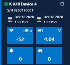
Figure 15 – Device list > Device state
- Summary, Data, Warnings, Configuration, and Operation tabs: shortcut to those sections for the selected device. They work the same way as the “Data > Standard”, “Configuration > Simple”, “Warnings” and “Operation” items from the main navigation bar with the only difference that there is no filter configuration because the device is already selected. Go to the corresponding manual sections to know how they work.

Figure 16 – Quick menu device tabs
- Sensors status: a side column with the last value and configured thresholds of the connected sensors.

Figure 17 – Home > Last reads and thresholds
3.1.4.2 Location overview
When the location view is selected and a location item is clicked over (in the list or on the map), the next information will be displayed:
·
Location state: the location item is expanded
when clicked over or at the ![]() symbol to see the main
information of the location and the information about the devices connected to
it:
symbol to see the main
information of the location and the information about the devices connected to
it:
o Number of unconfirmed warnings.
o Number of unconfirmed alarms..
o Devices linked to the station at these moment with its information (as at device view)


Figure 18 – Location list > Device state
- Summary, Data, Warnings, Location, and Operation tabs: shortcut to those sections for the selected device. They work the same way as the “Data > Standard”, “Operation > Location”, “Warnings” and “Operation” items from the main navigation bar with the only difference that there is no filter configuration because the device is already selected. Go to the corresponding manual sections to know how they work.

Figure 19 – Quick menu location tabs
- Sensors status: a side column with the last value and configured thresholds of the connected sensors.

Figure 20 – Home > Last reads and thresholds of the location
3.2 Data
This section offers a basic time-based analysis of the sensors connected to a device. The information consists of time history data (both in chart and table format) and some summary statistics of the selected sensors in the requested period.
All data are classified with a flag providing information on their validity. The first status flag of a data is always T (temporary) when the device sends it to the cloud. After, the status of the data can be changed automatically by the Kunak Cloud or by hand by an operator through the validation tool of the cloud.
· Automatic: when the cloud detects that the data is out of range instantly will change the state of the data to TI (Temporarily Invalid). The cloud analyses the data hourly, daily or weekly and can change the data to TI status in function of predefined cases. After, an operator needs to check the auto invalidations to change the status to I (Invalidated) or V (Valid)
· Manual (validation tool): the operator will change the status of the data based on the requirements. It can validate (V), invalidate (I) the data or corrected (O).
These are the available validation flags:
|
Validation |
Name |
Description |
|
|
Automatic |
T |
Temporary |
Raw data |
|
TI |
Temporary Invalid |
Data auto invalidate by the Kunak Cloud software. |
|
|
Manual |
I |
Invalid |
Invalided data manually by an operator |
|
V |
Valid |
Confirmation of the validity of the data manually by an operator. |
|
|
O |
Corrected |
Data corrected in base to a manual calibration |
Table 3 – Validation flags of the reads of a device
![]() The flag will only be set to GCc values in the case of gases and PM
values for particles, remaining the GC and PM raw data as temporary (T),
without applying any change other flag.
The flag will only be set to GCc values in the case of gases and PM
values for particles, remaining the GC and PM raw data as temporary (T),
without applying any change other flag.
A code is attached describing the reason of the flag selected for each data. Normally, for a temporary (T), valid (V) and corrected (O) data, the reason will be 0. The reason is important when the data flag is Temporary invalid (TI) or Invalid (I) to specify what produced that invalidation.
Code just use at the API REST
|
Code reason |
Reason |
|
0 |
n/a |
|
1 |
Calibration |
|
2 |
Maintenance / Repair |
|
3 |
Sensor Change |
|
4 |
Broken sensor |
|
5 |
Malfunction |
|
7 |
Stabilization period |
|
8 |
Inatallation / Relocation |
|
9 |
Natural Event |
|
10 |
Remote supervision |
|
11 |
Other |
|
12 |
Out of range |
|
13 |
Miscalibrated |
Table 4 – Reason why the readings of a device are invalidated
The temporarily invalid (TI) flag is set by the cloud automatically due to the following reasons:
|
Reason |
Applies to sensors |
Type (hourly, daily, …) |
Description |
|
|
4 |
Broken sensor |
Particles |
Hourly |
Particle sensor broken |
|
5 |
Malfunction |
Analog |
Hourly |
4-20mA Error |
|
5 |
Malfunction |
Particles |
Hourly |
Bad particle sensor air flow |
|
5 |
Malfunction |
Particles |
Instantaneous |
Bad particle sensor air flow |
|
5 |
Malfunction |
Gases |
Instantaneous |
Electronic error in the measure |
|
5 |
Malfunction |
Gases |
Hourly |
Electronic error in the measure |
|
5 |
Malfunction |
Particles |
Hourly |
Incorrect function of the particle sensor |
|
5 |
Malfunction |
Anemometer |
Daily |
Incorrect values of wind direction |
|
5 |
Malfunction |
Particles |
Daily |
Particle sensor obstructed |
|
5 |
Malfunction |
Gases |
Hourly |
Sensor broken |
|
5 |
Malfunction |
Gases |
Hourly |
Sensor broken or poisoned |
|
5 |
Malfunction |
Anemometer |
Weekly |
Sensor disconnected or broken |
|
7 |
Stabilization period |
Gases |
Daily |
Stabilization period |
|
12 |
Out of range |
Gases |
Hourly |
Ambient temperature outside the sensor working range |
|
12 |
Out of range |
Particles |
Hourly |
Humidity over 99% |
|
12 |
Out of range |
All |
Instantaneous |
Out of range |
|
12 |
Out of range |
Gases |
Daily |
Period of humidity out of range |
|
12 |
Out of range |
Gases |
Hourly |
Sensor saturated |
|
9 |
Natural Event |
Gases |
Daily |
High cross sensitivity gas is present in the air |
|
9 |
Natural Event |
Particles |
Hourly |
Possible presence of fog or water droplets |
Table 5 – Automatic invalidation reason
3.2.1 Standard Data
This section shows standard time series data both in chart and table format. Set the filters in the upper part and click on “Apply” to get a filtered view of the data. Any period and time zone can be selected to obtain the desired information from a device or user point of view. When several devices are selected, the UTC time zone is selected by default.
![]() Note: Chart resolution is limited to
125000 points in order to get reasonable performance in old computers/browsers.
To increase the date range, just select fewer devices and sensors.
Note: Chart resolution is limited to
125000 points in order to get reasonable performance in old computers/browsers.
To increase the date range, just select fewer devices and sensors.

Figure 21 – Data > Standard > Sensor historical data
Chart controls:
· Zoom in: Left click on the chart area and drag the pointer forming a rectangle that contains the area to be zoomed in.
· Reset zoom: Left click on “zoom out” or double click on the area chart.
· Reset chart: Click on “reset chart”. The zoom, legend, and thresholds will be eliminated.
· Legend: Show/hide a sensor by clicking on its items.
· Profile view: It shows all the time interval requested in the filter. The zoom options are the same as the ones from the main chart.
· Click on “summary” to browse to the statistics of every requested sensor:

Figure 22 – Data > Standard > Summary
With at least one configured threshold (max or min, max, and min), a button per threshold will be shown. Those buttons will show the sensor reads with a color based on the threshold (green: in bounds, red: out of bounds):

Figure 23 – Data > Standard >Threshold controls
The sensors read are presented in an
alternative format by selecting “Table” in the ![]() switch.
It switches to a table view where reads are paginated and ordered by date.
switch.
It switches to a table view where reads are paginated and ordered by date.
Optionally, the data can be exported in CSV
and TXT format by the buttons of the right corner of this view: ![]() Exported files can
contain up to 500000 samples.
Exported files can
contain up to 500000 samples.
3.2.2 Advanced Data
This section offers advanced data analysis functionalities that apply complex statistical postprocessing operations to data. The results are shown in several chart formats depending on the selected operation.
3.2.2.1 AQI Calendar plot
Explained in section 5.4 Advanced AQI calendar plot.
3.2.2.2 Calendar plot
It shows the evolution of a sensor in time using a calendar to represent the value of a statistical parameter in color scale, based on a daily aggregation. There are several key parameters for this type of plot:
· Hourly aggregation:
o Mean, summation, max and min: hourly mean, summation, maximum value, and minimum value. Dedicated to normal sensors.
o Counter: The amount a counter increases every hour. Dedicated to sensors that are counters.
o Number of occurrences: Number of 0 to 1 transition of a digital “open/close” sensor within an hour.
· Statistics:
o Mean, max, min, median, standard deviation: Daily mean, maximum value, minimum value, median.
o Frequency: Number of samples of a sensor/parameter per day.
o Summation: the accumulated value of all samples of a sensor.
Example: PM1 measured by a KunakAIR device
If we want to check the mean PM1 (particles with diameters lesser than 1 μm) of an air quality device on a daily basis for the last 4 months and highlighting values higher than 10 μg/m3, we must select a “Mean” hourly aggregation, a “Mean” statistic and a limit of 10:
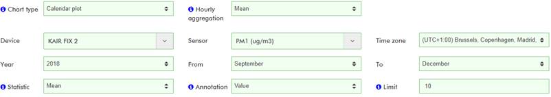

Figure 24 – Data > Advanced > Calendar plot
We can see in this example that the daily mean of PM1 has not exceeded 19 μg/m3 during the last 4 months and December obtains the highest values in terms of particle pollution.
3.2.2.3 Time variation
It allows analyzing the variation of a statistical parameter of a sensor concerning different cyclic periods (days, weeks, years, etc.), thus, establishing patterns of evolution in the behaviour of the parameter that is being analyzed. There are several key parameters for this type of plot:
· Hourly aggregation:
o Mean, summation, max and min: hourly mean, summation, maximum value, and minimum value. Dedicated to normal sensors.
o Counter: the amount a counter increases every hour. Dedicated to sensors that are counters.
o Number of occurrences: number of 0 to 1 transition of a digital "open/close" sensor within an hour.
· Statistics:
o Mean: the mean and the 95% confidence interval will be drawn.
o Median: the median and the quantiles 5/95 and 25/75 will be drawn.
Example: air quality index calculated by two KunakAIR devices located in the same city
We can check the time variation of the calculated air quality index (AQI, a qualitative measure with steps from 0 to 25, 25 to 50, 50 to 75 and 75 to 100, being 0 the best AQI value) for a couple of KunakAIR devices:

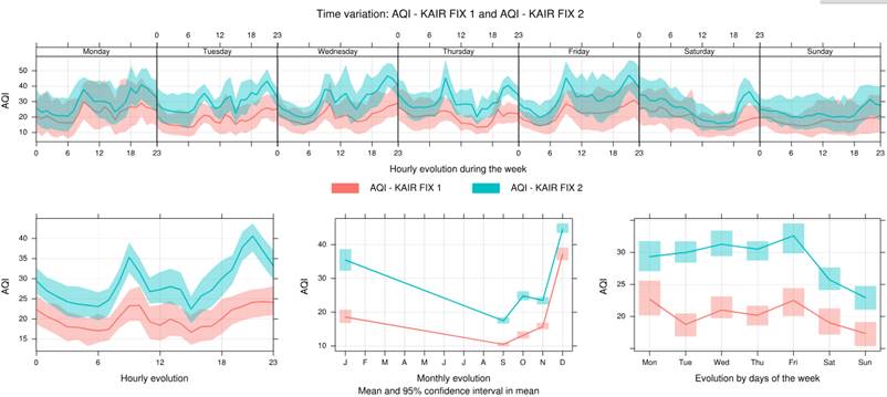
Figure 25 – Data > Advanced > Calendar plot
Some quick conclusions can be obtained in this example:
· AQI varies from 10 to 50 most of the time with a confidence interval of ±10 with the weekend being the best period of the week in terms of air quality for both devices.
· AQI is quite worse in the place where the FIX 2 device is placed.
· December is the month with the higher AQI values.
3.2.2.4 Noise level time variation
Is a type of graph similar to time variation but is useful for devices that have noise sensors (LAeq), calculating a time variation graph for each period of the day (LAeq,d , LAeq,e and LAeq,n). There are several key parameters for this type of plot:
· Hourly aggregation:
o Mean, summation, max and min: hourly mean, summation, maximum value, and minimum value. Dedicated to normal sensors.
o Counter: the amount a counter increases every hour. Dedicated to sensors that are counters.
o Number of occurrences: number of 0 to 1 transition of a digital "open/close" sensor within an hour.
· Statistics:
o Mean: the mean and the 95% confidence interval will be drawn.
o Median: the median and the quantiles 5/95 and 25/75 will be drawn.
Example: Noise level variation of a device in function of the 3 periods: day (d), evening (e), night (n).

Figure 26 – Noise level time variation (LAeq,d , LAeq,e and LAeq,n)
3.2.2.5 Noise level evolution (d,e,n)
Three noise sensor time (LAeq) plots, one for each period of the day (LAeq,d, LAeq,e and LAeq,n). One value per day is shown which is the average of all values for that day. There are several key parameters for this type of plot:
· Hourly aggregation:
o Mean, summation, max and min: hourly mean, summation, maximum value, and minimum value. Dedicated to normal sensors.
o Counter: the amount a counter increases every hour. Dedicated to sensors that are counters.
o Number of occurrences: number of 0 to 1 transition of a digital "open/close" sensor within an hour.
Example: 3 graph for each period of the day will be shown

Figure 27 – Noise level evolution (d,e,n)
3.2.2.6 Bar plot single device
It shows bars with height proportional to the values of the selected hourly aggregation (mean, max, min, counter, number of occurrences). Multiple sensors can be selected for one device. Grouping by sensor and month will show the selected statistic value.

Figure 28 – Bar plot: single device
3.2.2.7 Bar plot multiple devices
It shows bars with height proportional to the values of the selected hourly aggregation (mean, max, min, counter, number of occurrences). Multiple devices and sensors can be selected, and all the sensors are grouped device by device.
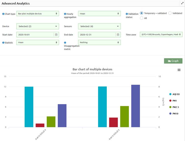
Figure 29 – Bar plot: multiple devices
3.2.2.8 Scatter plot
It allows checking how two or three sensors are related to each other disaggregating results based on different kinds of metrics. There are several key parameters for this type of plot:
· Hourly aggregation: what value to take for an average in an hour
o Mean, max and min: hourly mean, maximum value, and minimum value. Dedicated to normal sensors.
o Summation: the sum of the data per hour, ideal for partial counters.
o Counter: amount in which a counter has increased every hour. Dedicated to sensors that are counters.
o Number of occurrences: number of occurrences of the change in value from 0 to 1 per hour of a digital opening/closing sensor.
· Method: The representation of pairs of data by means of points in a scatter plot type x-y can generate an excess of points that prevents the correct interpretation of the graph, or what is known as "over-plotting". To solve this, we use different representation methods:
o Scatter: representation through points. It can be used with 2 or 3 variables
o Level: representation through a stepped surface divided by intermediate levels. It should be used with three variables.
o Hexbin: the representation consists basically in dividing the pairs of data that fall in each hexagonal cell and coloring its contents according to the number of occurrences. Only with two variables.
o Density: for the representation, it uses a kernel density estimation tool showing a continuous surface where the distribution in the density of the points in the color scale is presented. Only with two variables.
· Disaggregation metric: It allows data to be broken down into several graphs using one of the disaggregation metrics.
o Nothing
o Hours: 24 charts.
o Day/night: 2 charts, one for the day and another for the night.
o Day of the week: 7 charts (Mon, Tue, Wed, Thu, Fri, Sat, Sun).
o Months: up to 12 charts (Jan, Feb, Mar, Apr, May, Jun, Jul, Aug, Sep, Oct, Nov, Dec).
o Seasons: up to 4 charts (spring, summer, autumn, winter).
Example 1: temperature and relative humidity correlation in a single KunakAIR device
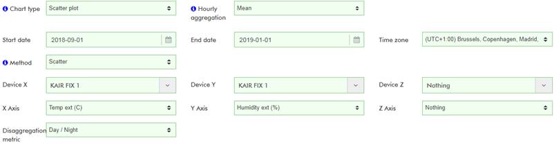

Figure 30 – Data > Advanced > Scatter plot for temperature and relative humidity
As the chart shows there is high correlation and inverse dependency between the external temperature and relative humidity.
Example 2: influence of PM2.5 and PM10 in air quality index disaggregated by day and night
We can check the influence of PM2.5 and PM10 (particles with diameters lower than 2.5 and 10 μm respectively) in the calculated AQI (a qualitative measure with steps from 0 to 25, 25 to 50, 50 to 75 and 75 to 100, being 0 the healthiest value) for a KunakAIR device.
Let’s check the results by selecting those 3 sensors:


Figure 31 – Data > Advanced > Scatter plot for AQI, PM2.5 and PM10
The following conclusions arise:
· PM10 has higher values than PM2.5, which is normal since particles of up to 2.5 µm diameter are included in particles of up to 10 µm diameters. Most of the PM10 values are lower than 25µg/m3, so they can be considered fair concentrations values.
· Most of the PM2.5 values are lower than 10 µg/m3, so they can be considered as good-fair concentrations values.
· With high values of PM2.5 or PM10, AQI is poor probably due to one of them being the main pollutant. Sometimes with low values of PM2.5 and PM10, AQI is too poor due to other pollutant (O3, NO2, SO2), since AQI is a parameter that depends on up to 5 parameters/pollutants.
· The regression line is more accurate at night due to the absence of extreme values.
3.2.2.9 Trend level
It allows analysing the trend of a disaggregated statistical parameter of a sensor according to the selected factor or parameter. There are several key parameters for this type of plot:
· Hourly aggregation:
o Mean, summation, max and min: hourly mean, summation, maximum value, and minimum value. Dedicated to normal sensors.
o Counter: the amount a counter increases every hour. Dedicated to sensors that are counters.
o Number of occurrences: number of 0 to 1 transition of a digital "open/close" sensor within an hour.
· Statistics:
o Mean, maximum: daily mean and maximum value.
o Frequency: number of samples of a sensor/parameter per day.
o Device X: If you want to select a sensor in the field of “X axis”, you must choose a device in this selector instead of selecting the value “None”.
o Device Y: The same described in the "Device X" but for the “Y axis”.
· Disaggregation metric:
o Nothing
o Hours: 24 charts.
o Day/night: 2 charts, one for the day and another for the night.
o Day of the week: 7 charts (Mon, Tue, Wed, Thu, Fri, Sat, Sun).
o Months: up to 12 charts (Jan, Feb, Mar, Apr, May, Jun, Jul, Aug, Sep, Oct, Nov, Dec).
o Seasons: up to 4 charts (spring, summer, autumn, winter).
o Every other sensor of the selected device: values are shown based on different ranges of this sensor.
Example: Let’s plot the trendof relative humidity based on the temperature values:


Figure 32 – Data > Advanced > Trend level plot
Some quick conclusions can be obtained:
· Relative humidity decreases as temperature increases.
· Early hours of the day tend to be the coldest ones.
· December is the coldest and wettest month (slightly wetter than November) of the requested period.
3.2.2.10 Correlation matrices
It shows, as result, a matrix with the correlation of the different sensors selected. If the inclination pattern of the ellipse is like "/", then the correlation is directly proportional. On the other hand, if the correlation follows the "\" pattern, then it is inversely proportional. The ellipse will be more or less flattened according to the strength of the correlation. There are several key parameters for this type of plot:
· Hourly aggregation:
o Mean, summation, max and min: hourly mean, summation, maximum values, and minimum value. Dedicated to normal sensors.
o Counter: the amount a counter increases every hour. Dedicated to sensors that are counters.
o Number of occurrences: number of 0 to 1 transition of a digital "open/close" sensor within an hour.
Example: Correlation between the external temperature and relative humidity:
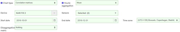

Figure 33 – Data > Advanced > Correlation matrices for relative humidity and external temperature
Relative humidity and temperature are inversely proportional, so the correlation is negative (-69%).
3.2.2.11 Polar frequency
It represents the statistical parameter of a sensor that we indicate for each of the combinations of wind speed and direction, using a colorimetric code for its representation. There are several key parameters for this type of plot:
· Hourly aggregation:
o Mean, summation, max and min: hourly mean, summation, maximum value, and minimun value. Dedicated to normal sensors.
o Counter: the amount a counter increases every hour. Dedicated to sensors that are counters.
o Number of occurrences: number of 0 to 1 transition of a digital “open/close” sensor within an hour.
o Wind device: the device to be used as a wind data source. Ideally the same one under analysis.
· Statistics:
o Mean, median, max, standard deviation: daily mean, median, maximum value, and standard deviation.
o Weighted mean: calculated according to the frequency of appearance. For instance, the contribution (%) to the mean of the PM1 samples based on the wind direction and speed value at the moment of being captured.
o Frequency: number of samples of a sensor for every range of wind direction and speed.
· Disaggregation metric:
o Nothing
o Hours: 24 charts.
o Day/night: 2 charts, one for the day and another for the night.
o Day of the week: 7 charts (Mon, Tue, Wed, Thu, Fri, Sat, Sun).
o Months: up to 12 charts (Jan, Feb, Mar, Apr, May, Jun, Jul, Aug, Sep, Oct, Nov, Dec).
o Seasons: up to 4 charts (spring, summer, autumn, winter).
o Every other sensor of the selected device: values are shown based on different ranges of this sensor.
To exploit this advanced data functionality, wind data are required. Such data can be directly provided by the selected device in case it is equipped with an anemometer or can be provided by another device equipped with an anemometer. In the latter case for data to be meaningful the device that provides wind data must be located close to the device whose data are being analysed.
Example: PM1 of an air quality device equipped with an anemometer.


Figure 34 – Data > Advanced > Polar frequency plot of PM1
Dashed circles represent the wind speed reference in m/s (the inner one is a reference of 0 m/s). The circle is divided into 4 sectors (W-N, N-E, E-S, S-W) of 90° each one divided into 9 sectors of 10°.
It is observed higher concentration of samples in the lower half, so it can be concluded that wind tends to blow from the south (southwest and southeast). Since there are more green and yellow values in the right half. PM1 seems to be higher when the wind blows from the east so there could be a source of PM1 in the east of the device location.
3.2.2.12 Polar plot
This functionality is quite similar to the polar frequency chart but with a differen graphic representation which, in this case, responds to mathematical modeling that smoothes the grid and ends up providing a continuous surface. There are several key parameters for this type of plot:
· Hourly aggregation:
o Mean, summation, max and min: hourly mean, summation, maximum value, and mininimun. Dedicated to normal sensors.
o Counter: the amount a counter increases every hour. Dedicated to sensors that are counters.
o Number of occurrences: number of 0 to 1 transition of a digital "open/close" sensor within an hour.
o Wind device: the device to be used as a wind data source. Ideally the same one under analysis.
· Statistics:
o Mean, median, max, and standard deviation: daily mean, median, maximum value and standard deviation.
o Weighted mean: calculated according to the frequency of appearance. For instance, the contribution (%) to the mean of the PM1 samples based on the wind direction and speed value at the moment of being captured.
o Frequency: number of samples of a sensor for every range of wind direction and speed.
· Disaggregation metric:
o Nothing
o Hours: 24 charts.
o Day/night: 2 charts, one for the day and another for the night.
o Day of the week: 7 charts (Mon, Tue, Wed, Thu, Fri, Sat, Sun).
o Months: up to 12 charts (Jan, Feb, Mar, Apr, May, Jun, Jul, Aug, Sep, Oct, Nov, Dec).
o Seasons: up to 4 charts (spring, summer, autumn, winter).
o Every other sensor of the selected device: values are shown based on different ranges of this sensor.
Since this plot shows a continuous surface, there is a more restricted limit for the period of time that can be analysed. Select, for example, a month instead of multiple months in this type of analysis. For wide periods, just split the original periods into smaller ones and analyze them one by one. Once each individual analysis is done, join them in your reports.
Example: PM1 of an air quality device equipped with an anemometer and located in the region of Madrid (Spain). This device has an anemometer too:


Figure 35 – Data > Advanced > Polar plot for PM1
The plot shows only a 1-month period analysis (November). As mentioned, this kind of plot shows a continuous surface, so there is a more restricted limit for the period that can be analysed. In this case, samples of PM1 when the wind was blowing from the northeast seem to be quite higher (red values). There might be a PM1 source located in the northeast.
3.2.2.13 Pollution rose
This graph is interesting, in its most basic use, to know if a certain parameter and its different values come from a certain wind direction.
· Hourly aggregation:
o Mean, summation, max and min: hourly mean, summation, maximum value, and minimun value. Dedicated to normal sensors.
o Counter: the amount a counter increases every hour. Dedicated to sensors that are counters.
o Number of occurrences: number of 0 to 1 transition of a digital "open/close" sensor within an hour.
o Wind device: the device to be used as a wind data source. Ideally the same one under analysis.
· Statistics:
o Contribution to total: the frequency with which the different wind directions appear for each of the data of the analysed set in a cumulative manner so that the units obtained are in percentage of the total data.
o Contribution to mean: the contribution to the mean (in %) of the parameter.
o Absolute count: the absolute amount of data.
· Disaggregation metric:
o Nothing
o Hours: 24 charts.
o Day/night: 2 charts, one for the day and another for the night.
o Days of the week: 7 charts (Mon, Tue, Wed, Thu, Fri, Sat, Sun).
o Months: up to 12 charts (Jan, Feb, Mar, Apr, May, Jun, Jul, Aug, Sep, Oct, Nov, Dec).
o Seasons: up to 4 charts (spring, summer, autumn, winter).
o Every other sensor of the selected device: values are shown based on different ranges of this sensor.
Example: PM1 of an air quality device equipped with an anemometer and located in the region of Madrid (Spain).


Figure 36 – Data > Advanced > Pollution rose for PM1
The plot shows only 1-month period analysis (November). In this case, the wind blows from the southwest most of the time (more samples) while samples coming from the southwest are quite higher . There might be a PM1 source located in the northeast.
3.2.2.14 Basic statistics
This type of advanced graph is interesting in order to know the basic statistics of the parameters of a device.
· Hourly aggregation:
o Mean, summation, max and min: hourly mean, summation, maximum value, and minimun value. Dedicated to normal sensors.
o Counter: the amount a counter increases every hour. Dedicated to sensors that are counters.
o Number of occurrences: number of 0 to 1 transition of a digital "open/close" sensor within an hour.
Example: Basic statistics of CO, NO2 and NO of a device located in the region of Navarra (Spain).

Figure 37 – Data > Advanced > Basic statistics GOLD 1: CO, NO2 and NO
The table shows the statistics in all period selected (August to October). The calculated statistics are as follows:
· Mean: period average
· Maximum: maximum hourly value
· Minimum: minimum hourly value
· Median: period median
· Maximum rolling eight-hourly mean: maximum eight-hourly rolling mean of all period
· Maximum rolling 24-hourly mean: maximum 24-hourly rolling mean of all period
· 95th and 99th percentile
3.2.2.15 Air quality basic statistics
Explained in section 5.5 Air quality basic data statistics.
3.2.2.16 Statistics between two sensors
This type shows the basic statistics comparing two sensors, which can be from the same or from different devices.
· Hourly aggregation:
o Mean, summation, max and min: hourly mean, summation, maximum value, and minimun value. Dedicated to normal sensors.
o Counter: the amount a counter increases every hour. Dedicated to sensors that are counters.
o Number of occurrences: number of 0 to 1 transition of a digital "open/close" sensor within an hour.
Example: Basic relation NO between two devices located in the region of Navarra (Spain).

Figure 38 -- Data > Advanced > Basic relation NO between GOLD 1 and GOLD 2
The table shows the relationship statistics in all period selected (August to October). The calculated statistics are as follows:
· Mean sensor X and Y
· Standard deviation sensor X and Y
· r2: a statistical measure of how close the data are to the fitted regression line.
o -1,00 = Perfect negative correlation
o -0,90 = Very strong negative correlation
o -0,75 = Considerable negative correlation
o -0,50 = Intermediate negative correlation
o -0,10 = Weak negative correlation
o 0,00 = There is no linear correlation between the variables
o 0,10 = Weak positive correlation
o 0,50 = Intermediate positive correlation
o 0,75 = Considerable positive correlation
o 0,90 = Very strong positive correlation
o 1,00 = Perfect positive correlation
· Regression line curve: it is the linear regression equation
· MAE: mean absolute error that the X sensor has with respect to the Y sensor
· Standard deviation of the absolute error
· 90% confidence interval: The maximum error absolute that obtained within 90% of the data with less error.
· RMSE: the root mean square error. The RMSE is a measure of precision. The RMSE is always non-negative, and a value of 0 (rarely resulted in practice) indicates a perfect fit to the data.
3.3 Warnings
The device is collecting data from its sensors and it has been checked that samples are being received and stored in Kunak Cloud. However, some parameters can be critical, so it is interesting to get notifications and show a warning on the platform whenever they exceed certain thresholds.
A warning will appear when the value of a sensor exceeds a pre-set value a consecutive number of times. Threshold values (Max-Min), and the number of repetitions (Persistence) can be configured in the Configuration menu (Configuration>Simple>Sensor>Threshold Warnings). See 3.4.1.3 Simple Sensor or 3.4.2.2 Multiple Sensors.
Once the thresholds of a sensor are set, every time X consecutive samples (where X=configured persistence) of a sensor exceed the maximum or minimum thresholds, a warning will be registered in the platform. This warning can be checked by browsing to:
· The “Warnings” section in the top menu.

Figure 39 – Access to “Warnings” top menu
· To the “WARNINGS” tab of a selected device in the “Home” section.

Figure 40 – Access to “Warnings” dashboard secction
By default, all active warnings will be shown in a paginated table. Set the filters in the upper part and click on “Apply” to get a filtered view of the warnings. Any period and time zone can be selected to obtain the desired information from a device or user point of view.
![]() Note: When several devices are
selected, the UTC time zone is selected by default.
Note: When several devices are
selected, the UTC time zone is selected by default.
There are 3 types of warnings which can be filtered by checking or unchecking the checkboxes contained in the filter:
· Active: warnings triggered automatically by the device. They cannot be confirmed and they will be closed once the conditions (sensor threshold) that triggered them are not met (sensor readings return back within thresholds range). Once an active warning is closed automatically, it will change its state to unconfirmed.
· Unconfirmed: closed warnings that need to be checked by the user. Once an unconfirmed warning is checked, it changes its state to “confirmed”.
· Confirmed: a warning already checked by the user.
Confirms the unconfirmed warnings in the data table by checking the box and then clinking at the “confirm” button It can be confirmed the warnings that still active.

![]()
Figure 41 – Confirm single and all warnings buttons
Upon clicking on the icons ![]()
![]() ,
alarms can be ordered by ascending (
,
alarms can be ordered by ascending (![]() ) or
descending (
) or
descending (![]() ) start/end date:
) start/end date:
![]()
The warnings table can be exported to CSV or TXT files by clicking on the “CSV” and “TXT” buttons at the top right of the table.

Figure 42 – Checking warnings
In the upper image, multiple warnings of the external humidity and the signal sensors are displayed. The humidity warnings have been generated because the sensor has exceeded the 99% max (persistence=5) threshold several times. The signal warnings have been generated because mobile communications have worsened in certain moments obtaining poor signal levels, below -115 dBm.
All these warnings can be confirmed one by one (by checking the “state” column of every row) or all at once (by clicking on the “Check all” button). A device will return to “Online” status once all the unconfirmed warnings of a device have been confirmed and there are no active warnings. Warnings should be checked and confirmed by the person responsible for the device’s management.
Warnings are registered as soon as X consecutive samples of a sensor exceed the maximum or minimum threshold being X=persistence. This happens because Kunak devices send warnings as soon as they occur without waiting until the next sending period.
To configure the threshold warning for a specific sensor, check 3.4.1.3 Simple Sensor section.
How to enable notifications is described at 3.9.1.4 Email notifications section.
3.4 Configuration
With the device already deployed, it is possible to change its configuration remotely in many ways:
- Single device dashboard: quick access through the “Home” dashboard by clicking on the device tag in the device list on the left and switch to the “CONFIGURATION” tab.

Figure 43 – Quick access to single device configuration
- Configuration section: click on the “Simple” option of the “Configuration” menu and select the device.

Figure 44 – Single device configuration
As it can be seen, both ways end showing the same section: a section with the tabs “General info”, “Device”, ”Sensor”, each of one allowing to set different settings.
Kunak devices spend most of their duty cycle in sleep mode but they can receive new configurations every time they connect. Those new configurations are queued every time a user updates the device configuration through Kunak Cloud web or Kunak Cloud REST API and they are sent to the device as soon as it connects. Only the most recent configuration of every parameter will be sent to the device. These settings will be applied within the device immediately after its connection and the configuration queue will be emptied.
In Kunak Cloud web, every input associated with a queueable parameter (a parameter that will be sent to the device) is followed by the current value stored on the device in parentheses:
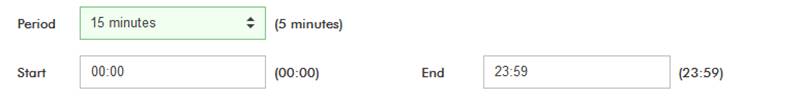
Figure 45 – Queueable parameter: current and editable value
In the above image, the sensor “Sampling period” currently stored in the device is 5 minutes but it will be set to 15 minutes once the device receives the queued configuration.
Once the new configurations are queued, a pop-up confirmation message will be shown in the top right corner of the web:

Figure 46 – Confirmation message for new queued configurations
3.4.1 Simple Configuration
This section allows the configuration of a single device. Settings are divided into device, sensor, operational parameters and optional parameters. There is a menu on the left with a tab for every group of those settings.
3.4.1.1 General info
It contains the core information about the current configuration of a device:
· Basic info: parameters related to the production of the device (serial number, part number), the current firmware versions, registration date in Kunak Cloud, and identification information.
· Device image: Shows the image of the device if it is upladed an selected.
· State: parameters related to communications, location, energy management, and sensor configurations.
· Cartridge: Only for AIR devices. It shows the information of the cartridges plugged to the device.
· Sensors: tabbed information of the currently connected sensors.

Figure 47 – Configuration > Simple > General info
In order to ease administrative operations, this information can be exported to a PDF document by clicking on the “.PDF” button.
3.4.1.2 Simple Device
Basic device settings can be edited here. Those settings include tagging information, location, energy consumption, communications, and notifications. By leaving empty an input, its associated parameter in the device will keep its current value.
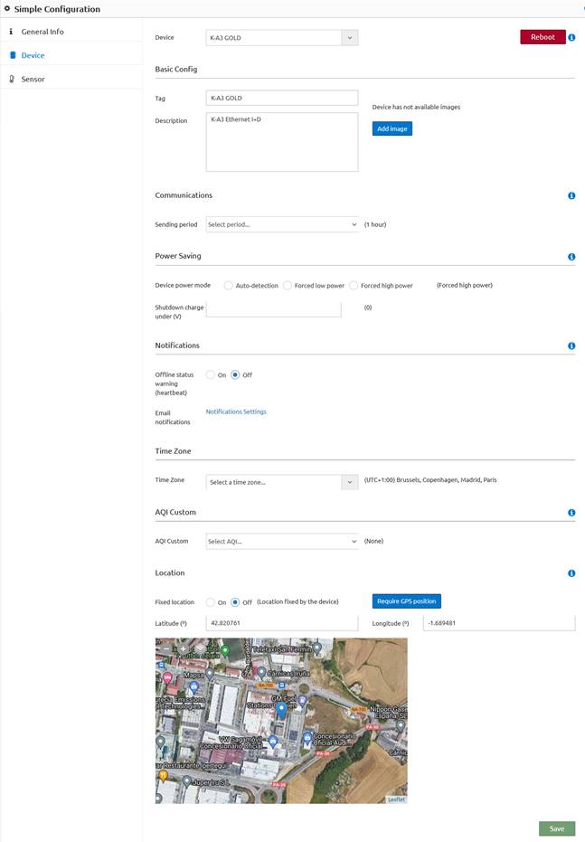
Figure 48 – Configuration > Simple > Device
Those settings are explained hereunder:
· Device: selected device to configure
· Basic Config:
o Tag: way to identify a device within the user’s context. The tag is specific to each account, i.e., each account can configure its own tag for the same device. Is limited to 40 characters.
o Description: unique description of a device. Allows more detailed identification with up to 200 characters.
o Images: Select or upload a photo of the device or its final installation to help for locating it and for the support. If photos have been uploaded at the CMMS section, they can be selected here.
· Communications:
o Sending Period: devices connect to Kunak Cloud every “Sending period”. For example, if a device was switched on at 10:00 and the ”Sending period” is 300 seconds (5 minutes), it will connect at 10:05, 10:10, 10:15 and so on. Kunak devices spend most of the time in sleep mode and only communicate with the platform every sending period. It means that there is a fixed time window to send the device the new settings. When a user edits those settings through Kunak Cloud web application or Kunak Cloud REST API, they are queued until the device connects again and receives them. Once the device confirms the reception of those new settings, setting queues are empty.
· Power Saving:
o Device power mode: only available for air quality devices at the moment. Since optical particle sensors use a laser, power consumption should be taken into account depending on the application scenario (samples needed for a pollution study, access to a power network,…). This option will save battery but the particle sensor will be on only 10% of the time and the device sending period will be changed automatically to a minimum value of 10 minutes. It can be configured in different options:
§ Auto-detection: The platform will auto detect the best working mode for the device and will automatically change it (modes can be changed between high power and low power).
§ Forced high power mode: OPC will take a sample of PM1, PM2.5 and PM10 every sampling period.
§ Forced low power mode: this option will save battery. The particle sensor will take measures for 1 minute every 10 minutes. Sampling configuration will be ignored and the minimum sending period will be 10 minutes.
o Shutdown charge under: if the voltage of the charger goes below the voltage specified, the device will shutdown. To avoid the shutdown in every case, 0 V is required. This is useful, for example, when a device is connected to a car and it is wanted to shutdown the device when the car stops to prevent the car battery drains.
· Notifications:
o Offline status (heartbeat): enable it to notify every time a device does not connect within the estimated communication window which is defined by the following time interval: [last connection date, last connection date + sending period * persistence + mobile communications offset]. Kunak devices can be devided into two categories depending on the system they implement to be switched on and off
§ Devices with button: some Kunak devices (air quality, noise) include a button to switch on/off the device. Upon switching off a device, the “Offline” option will be disabled automatically.
§ Devices without button: the vast majority of the M2M and industry 4.0 Kunak devices are distributed as K-1xx/K-2xx standalone boards so they come ready to be integrated within machines or installed on a DIN rail. Those devices are powered by the power source of the machine or facilities where they are placed, so once this power is disconnected, devices are switched off without informing the Kunak Cloud platform. That is why “Offline” notification should be disabled manually on those devices.
o Email notifications: enable it to receive email notifications of offline devices (Kunak heartbeat alerts) and threshold warnings. See how to configure it at 3.9.1.4 Email notifications section.
· Time zone: Select the correct time zone for the location of the device or specifications for a project. The device will always store its measures with a UTC timestamp, but time zone configuration affects to the default time zone while using the device in the cloud and visualizing data.
· AQI Custom: Only for AIR devices. The European AQI and EPA AQI are always calculated, but a third one can be calculated for the device. Select the AQI you want to calculate from the drop down menu and the custom AQI will start to be calculated as soon as you save the configuration. From the section "User Settings > General > Visualization Preferences" you can change the AQI to be displayed in the application. See 3.9.1.2 General preferences for more info.
· Geographical position: If the device is not properly positioned on the map its position can be changed here:
o Fixed Position On: The device position is fixed by the user writing the latitude and longitude or by moving the pin at the map. Position sent by the device will be discarded.
o Fixed Position Off: the device will be located on the map according to the coordinates given by the GPS or the communications beacons.
o Require GPS position: with these button you can ask the device to get its current geographical position and send it to the cloud. This option works only for devices equipped with a GPS module. This option doesn’t work if Fixed Position selector is “On”.
· Reboot: It is possible to reboot the device by pressing the “Reboot” button. Try using this function whenever a device is not working properly to fix it.
![]() Note 1: in Kunak Cloud web,
every input associated with a queueable parameter (a parameter that will be
sent to the device) is followed by the current value stored on the device in
parentheses.
Note 1: in Kunak Cloud web,
every input associated with a queueable parameter (a parameter that will be
sent to the device) is followed by the current value stored on the device in
parentheses.
![]() Note 2: The new settings will be
queued until a device connects again so only the most recent configuration will
be sent to the device. These settings will be applied immediately after this
connection and the configuration queue will be emptied.
Note 2: The new settings will be
queued until a device connects again so only the most recent configuration will
be sent to the device. These settings will be applied immediately after this
connection and the configuration queue will be emptied.
![]() Note 3: Kunak devices send their
location only at start-up. Therefore if a device is moved after its start-up to
update its location on the map the device must be rebooted or GPS position
update must be requested.
Note 3: Kunak devices send their
location only at start-up. Therefore if a device is moved after its start-up to
update its location on the map the device must be rebooted or GPS position
update must be requested.
3.4.1.3 Simple Sensor
Configure a single sensor of a single device. Editable settings include sampling, threshold, response curve and output format. Sensors are identified by the tag given by the user with the “Kunak Device Configurator” desktop application at the moment of its configuration previous to the final installation.

Figure 49 – Configuration > Simple > Sensor
The following parameters of a sensor can be configured:
· Sampling: each period that the sensor will store a sample within the time window from “Start” to “End”.
· Threshold warning: whenever as many consecutive samples as the defined persistence value exceed the configured thresholds, a warning will be triggered and it will be registered in the platform and notified (if email notification is enabled) to the user. By disabling (check the checkbox “Disable”) a threshold, no threshold warnings will be triggered. See section 3.3 Warnings for more information.
·
Response curve:
the value read of a sensor will be converted according to the polynomial curve configured. This functionality
can be used to convert for example an analog input into a human redeable value.
The default values are ![]() .
Polynomial curve:
.
Polynomial curve:
![]()
· Data format: every value of a sensor will be shown with as many digits in the decimal part as the value set in the “Precision” field.
Enter/select the desired new values for the parameters and click on “Save” to queue them. Once the device connects again, it will update all these parameters.
![]() Note 1: in Kunak Cloud web,
every input associated with a queueable parameter (a parameter that will be
sent to the device) is followed by the current value stored on the device in
parentheses.
Note 1: in Kunak Cloud web,
every input associated with a queueable parameter (a parameter that will be
sent to the device) is followed by the current value stored on the device in
parentheses.
![]() Note 2: The new settings will be
queued until a device connects again so only the most recent configuration will
be sent to the device. These settings will be applied immediately after this
connection and the configuration queue will be emptied.
Note 2: The new settings will be
queued until a device connects again so only the most recent configuration will
be sent to the device. These settings will be applied immediately after this
connection and the configuration queue will be emptied.
3.4.1.4 Simple Operational parameters
This section will be visible only for custom accounts that require it. An operational parameter is an additional attribute with a value that can affect the operation of a device. This value can be of different types: number (integer or decimal), text or binary. The operational parameters can belong to a Kunak device or an external one connected through communication protocols such as Modbus. The following image shows the operational parameters of a machine connected to a Kunak Industry 4.0 device using Modbus:

Figure 50 – Configuration > Simple > Operational parameters
Click on a table row (a row will be highlighted when the mouse pointer is over it) to configure a single parameter. A modal dialog appears:


Figure 51 – Configuration > Simple > Operational parameters > Edit parameter
Enter the desired new value for this parameter and click on “Apply” to queue it. The entered value must be supported by the data type, otherwise the process validation will fail and no changes will be applied. The same happens if a user tries to edit a “read only” operational parameter.Once the device connects again, it will update (write to the Modbus register) the new operational parameter. Since these parameters affect the operation of the device, the device itself will check if the queued value is valid for device operation and it will confirm to Kunakcloud that the parameter has been applied. In case that the queued value is not considered valid by the device, the device itself will discard it and send back to Kunk Cloud the value set to this parameter instead of the queued one. In this case Kunak Cloud will notify the setting mismatch to the user by marking in red the parameter entry in the Operational parameters table.
![]() Note: The new settings will be
queued until a device connects again so only the most recent configuration will
be sent to the device. These settings will be applied immediately after the
device connection and the configuration queue will be emptied.
Note: The new settings will be
queued until a device connects again so only the most recent configuration will
be sent to the device. These settings will be applied immediately after the
device connection and the configuration queue will be emptied.
3.4.1.5 Simple Optional parameters
This section will be visible only for custom accounts that require it. An optional parameter is an additional informative attribute with the key-value format. It can be useful to store information about production like serial number, model and so on.

Figure 52 – Configuration > Simple > Optional parameters
Enter the desired new values for these parameters and click on ”Save” to queue them. Once the device connects again, it will update all those operational parameters.
![]() Note 1: in the Kunak Cloud
web, every input associated with a queueable parameter (a parameter that will
be sent to the device) is followed by the current value stored on the device in
parentheses.
Note 1: in the Kunak Cloud
web, every input associated with a queueable parameter (a parameter that will
be sent to the device) is followed by the current value stored on the device in
parentheses.
![]() Note 2: The new settings will be
queued until a device connects again, so only the most recent configuration
will be sent to the device. These settings will be applied immediately after
this connection and the configuration queue will be emptied.
Note 2: The new settings will be
queued until a device connects again, so only the most recent configuration
will be sent to the device. These settings will be applied immediately after
this connection and the configuration queue will be emptied.
3.4.2 Multiple Configuration
This section allows configuring multiple devices at a time which is useful to simplify the process when having multiple devices of the same type (air devices, M2M devices…) working under the same conditions.
3.4.2.1 Multiple Devices
Select multiple devices and update their basic settings at once. For more explanation of every parameter that can be configured, see 3.4.1.2 Simple Device.

Figure 53 – Configuration > Multiple > Device
3.4.2.2 Multiple Sensors
Select multiple devices and sensors and update their settings at once. For more explanation of every parameter see 3.4.1.3 Simple Sensor.

Figure 54 – Configuration > Multiple > Sensor
It is possible to select multiple devices and sensors at once. When adding (checking) a device to the “Device” selector, its sensors will be added to the “Sensors” multiple selector. If two or more sensors from multiple devices have a common tag, the same tag will be added for all the sensors selected. Once all the sensors from the different devices have been selected to configure, click on “Save” and the new configurations will be queued. Once the devices connect with the Kunak Cloud, the new configuration will be applied.
3.4.2.3 Multiple Operational parameters
Update (queue) an operational parameter of one or multiple devices. The update will only be queued for those devices that include the requested operational parameter configured with the same data type as the “New value” (decimal, integer, text o bitmask).

Figure 55 – Configuration > Multiple > Operational parameters
3.5 Operation
This menu item gives access to the sector-specific tools that will help with the operation procedure for a device or a network.
3.5.1 Alarms
Alarms are automatically launched by the cloud in order to help with the operational management of a device network. The heartbeat and the battery alarms are triggered always, but the advanced operation alarms only are triggered for devices with the add-on operational package.
The different columns of the table:
· Parameter: Element that has triggered the alarm.
· Description: Why the alarm has occurred.
· Help: Tips to solve the possible problem.
· Start/End: Time interval from the problem was detected until it was solved. It will remain active until Kunakn Cloud detects its end.
· Checked by: Person and time when the alarm was confirmed.
States of the alarms:
· Active: A persistent alarm in time. The alarm can be confirmed by the user if necessary.
· Unconfirmed: The alarm is over. The user should confirm the cause of the alarm.
· Confirmed: The alarm has been manually confirmed by the user.
Control buttons:
· 'Confirm': Confirms the unconfirmed (including actives) alarms in the data table by checking the box and then clinking at the “confirm” button.

Figure 56 – Operational Alarms
The different codes of the operation alarms that can be found, are described below.
|
|
|
|
|
|
|
0 |
Device |
Instantaneous |
Heartbeat: Connection has
been lost |
Possible coverage problem, with the mobile operator or incorrect disconnection of the battery. |
|
1 |
Device |
Instantaneous |
Modbus reading error |
Check if Modbus RS-485 cable is properly connected and if the device is properly configured and powered. |
|
2 |
Device |
Instantaneous |
Working temperature out of range |
Check that the device and its sensors have not suffered any damage |
|
3 |
Sensor |
Hourly |
Broken or wrongly connected sensor. |
Replace the sensor |
|
4 |
Device |
Hourly |
Error in the power supply of the analog measurement part of the gas sensors |
Check that the internal wiring is correctly connected and that the voltage is reaching the PCB where the gas sensors are connected |
|
5 |
Sensor |
Daily |
Saturated or broken sensor |
The sensor has been exposed to concentrations greater than its measurement range. Wait until the concentration levels return within the sensor measurement ranges or place it in a clean area and wait for its stabilization. If after 72 hours is the issue has not beensolved, the sensor might have been damaged and needs to be replaced. |
|
6 |
Sensor |
Hourly |
Broken sensor or extremely dry or wet. |
Locate the sensor in a clean area at 50% of RH and wait for its stabilization. If it does not recover to its normal values, replace the sensor |
|
7 |
Sensor |
Daily |
Poisoned or broken sensor |
PLace the sensor in a clean area for 72 h to observe if it recovers. If the error remains, replace the sensor. |
|
8 |
Sensor |
Daily |
Particle sensor partially obstructed. |
Clean the particle sensor and filters according to the manual |
|
9 |
Sensor |
Daily |
Particle sensor obstructed. |
Clean the sensor and filters immediately according to the manual to avoid possible damage to the sensor itself. |
|
10 |
Sensor |
Daily |
Air flow failure in the particle sensor |
Clean the sensor and restart it. If this error appears constantly, the sensor might be obstructed or broken. Contact technical support. |
|
11 |
Sensor |
Hourly |
Particle sensor laser probably broken. |
Contact technical support to replace the sensor. |
|
12 |
Sensor |
Hourly |
4-20 mA sensor disconnected, not powered, broken or out of range. |
Check the connection of the sensor and its correct operation. |
|
13 |
Sensor |
Daily |
Wind direction sensor blocked or broken. |
Check the free movement of the wind vane. |
|
14 |
Sensor |
Daily |
Wind direction sensor broken. |
Check the correct connection of the wind vane. |
|
15 |
Sensor |
Daily |
At least 50% of data are missing for the last 24 h |
|
|
16 |
Sensor |
Daily |
The sensor has a serious problem, and its data are not being received. |
Check that the sensor is operating properly. If does, restart the device. If the error persists, contact technical support. |
|
17 |
Sensor |
Daily |
High internal temperature inside the device |
Check the working conditions of the device to avoid any damage of their internal components (battery, some sensors...). |
|
18 |
Device |
Instantaneous |
Heartbeat: Lost of connexion
probably due to battery discharge. |
Either recharge, replace the battery or check the correct operation of the power supply. |
|
19 |
Sensor |
Weekly |
Wind sensor disconnected or broken |
Check the correct connection of the wind sensor |
|
20 |
Sensor |
Daily |
Power supply or solar panel disconnected or broken |
Check the power supply or the solar panel connection, and its correct operation. |
|
21 |
Sensor |
Hourly |
Primary battery low or power voltage reduced |
Check the power voltage or replace the primary battery. |
|
22 |
Sensor |
Hourly |
Device close to run out of battery |
Check the correct connection of the power supply. |
|
23 |
Sensor |
Weekly |
The gas sensors have been working too long out of their recommended humidity range. Extended exposure to humidity below 15% or above 85% could damage these sensors |
Place the device outside these humidity conditions to recover the gas sensors. |
|
24 |
Sensor |
Daily |
The gas sensor baseline may be slightly out of calibration. |
Recalibrate the gas sensor baseline. |
|
25 |
Sensor |
Daily |
Gas sensor baseline is out of calibration reducing sensor accuracy |
Urgently recalibrate the sensor baseline |
|
26 |
Sensor |
Daily |
The gas sensors have been working below the recommended humidity range. Extended exposure to a relative humidity below 5% may damage these sensors |
Place the device outside these humidity conditions to recover the gas sensors. |
|
27 |
Device |
Instantaneous |
Incorrect sensor initialization |
Reset the device. If persist, contact support |
|
28 |
Device |
Instantaneous |
The device could NOT be geolocated correctly |
When the device is indoors, it may fail. Make sure the device is outdoors and try asking it to geolocate the device automatically. |
|
31 |
Device |
Daily |
The device is not working properly. Error "V_V5_Aux" |
Please, contact with support to solve the problem |
|
32 |
Device |
Daily |
The device is not working correctly. (Error: PCB Gases) |
Please, contact with support to solve the problem |
|
33 |
Sensor |
Daily |
Weak mobile coverage |
Consider placing the device in another location with more coverage to avoid data loss |
|
34 |
Device |
Daily |
Device is not sending data to the platform |
Possible error in the device or in the communications. Try restarting the device. |
Table 6 – List of all the operation alarms that can appear
3.5.2 Operation Data
It works the same as in section 3.2.1 Standard Data, but only Kunak Air devices with the Operational packages can be displayed, as well as the sensors related to the operation, maintenance, and calibration of the device. Some of the extra sensors that could be displayed are the gas GC (with its negative values), PM_SFR (particle sample flow rate).
3.5.3 CMMS
CMMS: Computerized maintenance management system. Record and consult all the actions that have occurred to a device over time (only available for devices with the add-on operational package). Some of the actions are generated automatically and others have to be added by the network operator.
3.5.3.1 Action Register
Logging every action will help network operators to manage and maintain a device network as well as communicate with other users about the activity realized to the devices.
The action to register can be one of the next categories:
· Calibration: The moment when a device has been calibrated.
· Sensor change: Time when a sensor has been replaced from the device.
· Stabilization period: Time interval between the start of the device and when the measurements can be taken into account.
· Remote supervision: date where a remote inspection has been carried out the device and its data, explaining the results of this inspection.
· Maintenance / Repair: Time interval where the device is under maintenance.
· Malfunction: Time interval where a device is not working properly.
· Installation / Relocation: Log of device location change. Usually, it is registered automatically.
· Others: actions that are not included in the above categories.
The date of an action varies in function of the category selected. Some categories are instantaneous, so only one date is needed, but others cover a period, so you have to enter the start and end date.
It is required to complete the description of the action, with the possibility of adding an observation. If it is needed, files and photos can be attached to the action.

Figure 57 – Action register
3.5.3.2 Logbook
Place to see all the actions registered of one or more devices.

Figure 58 – Logbook
An action can be edited or delete (only by the person that creates it) by clicking on it.

Figure 59 – Edit an action log of a device
3.5.3.3 History and Logs
Section where you can find everything that has happened to a device or location and who has performed that action.

Figure 60 – History and Logs
You can find:
· Device config history: all actions, changes, editions,... made to devices.
o Configuration history: All the historical configuration applied to a device or its sensors is saved to find out what its configuration was at a given time.
§ Firmware versión
§ Sending period
§ Status after reboot
§ OPC low power mode
§ Sensors board version
§ SIM ICCID
§ IMEI
§ Gas board version
§ Time zone
o Devices action log: Historical actions done by an account to devices through the cloud.
§ Reboot device
§ OPC power saving mode
§ Heartbeat service
§ Edit device geo coordinates
§ Edit device periods config
§ Edit device thresholds config
§ Edit device response curve
§ Check all events
§ Check single event
§ Simple scheduled actuation
§ Simple periodic actuation
§ Update operational parameter
§ Calibration
§ Update time zone
§ Reset the totalizer counter
§ Shutdown from button
§ Advanced configuration
o Cartridge history: history of cartridges that have passed through a device.
· Sensor config history: event history of a given sensor of a device.
o Sampling period
o Alarm thresholds
o Response curve
o Power source type
o Preheat time (s)
o Sensor configuration type
· Cartridge history: devices for which a cartridge has been connected.
· Location Log: actions taken to locations.
o Create location
o Edit location
o Delete location
o Link location to user
o Unlink location to user
3.5.3.4 Operational parameters history
Some Kunak devices are integrated with other devices to equip them with an internet connection. For example, some Kunak devices are configured as a Modbus master to control machines remotely. The Kunak device can read from registers or write to them. All of this is done through operational parameters.
In this section, it is possible to check the updates history done to an operational parameter of a single or multiple devices. Updates are shown in a table by clicking “Apply” after selecting the device, the operational parameter tag, the period and the time zone in the filter:

Figure 61 – Operational parameters history
Every time an update occurs, a new entry will be shown in the table and the “end date” of the previous entry will be updated (from empty to “Month day, year, hour”) with the date of the ‘start date” of the new entry corresponding to this update.
3.5.4 Gas and Particle calibration
KunakAir devices can be configured using this calibration tool,acceding by clicking on “Operation > Gas & Particle calibration”. For more information about how to use it, consult the user manual of the KunakAir that can be downloaded from the “Support” menu.
3.5.5 Locations
A location is a virtual site created by the user to analyse location data without taking into account the devices that have passed through the place. Allows you to manage your data by locations by assigning devices to specific spots.
![]() You can create as many virtual locations as you want, but you can
only add devices to the created locations that have an operating package.
You can create as many virtual locations as you want, but you can
only add devices to the created locations that have an operating package.
The devices can be shared to other accounts and each account can name it with its name. As devices, locations will have an Id that will always be the same in order to identify the locations no mater the name stablish in the account.
3.5.5.1 New Location
While creating a new account, you must fill all the information asked:
· Tag: name of the location.
· Description: a brief description of the location can be added.
· Time zone: at what timezone you whant to see the data of the devices added.
· Latitude, Longitude: position of the location. It can be selected at the map bellow or by hand.
· Devices: add the devices that are at that place with the period that they have been there. If you select “unfinished” the end period will remain open.
· Create: click on these button in order to finish the process.

Figure 62 – New Location creation
3.5.5.2 Consult or Edit Location
At these section you can consult or edit a location already created and the historical of devices. It can be changed the, name, description, time zone, position over the map and the devices located at the spot.

Figure 63 – Consult or edit a location
3.5.5.3 Link or Unlink Location
Link or unlink locations to different accounts. Select the accounts, link or unklin and the locations you what to share with them.
![]() In order to see the devices of that location, the account linked to
the location must have the devices already linked to it.
In order to see the devices of that location, the account linked to
the location must have the devices already linked to it.
![]() Admin accounts can see in this section all their locations and all
the locations of their users and can link or unlink location to themselves.
Admin accounts can see in this section all their locations and all
the locations of their users and can link or unlink location to themselves.

Figure 64 – Link or unlick locations to other accounts
3.6 Tools
This menu item gives access to the sector-specific tools that are available in Kunak Cloud.
3.6.1 Validation
Data validation allows getting useful and correct data by cleansing data sets according to certain rules which depend on the field of application. Kunak Coud offers currently a manual validation service so it is possible to filter data in multiple services (basic data, advanced data, reports) according to its validation status.
Validation service can be accessed by clicking on the “Tools > Validation” item.
![]() The different flags that can be applied to the data are described at
3.2 Data
section.
The different flags that can be applied to the data are described at
3.2 Data
section.
In the case of gases, only the GCc values will be validated/invalidated, remaining the GC values was raw data. For particle data, PM raw data will remain without any change.
3.6.1.1 Manual validation
In this section, it is possible to manually validate a range of data for a single device and sensor. Auxiliary devices and sensors can be selected to compare data.

Figure 65 – Manual validation’s home
The section contains 3 main blocks:
· Device, Sensor, and Auxilliary selectors: used to select the sensor data that will be validated. The Auxilliary sensor can support the validation decisions by comparing it with the device under validation in the chart, for instance by using them as reference data
· Chart: it shows the sensor data within the selected period in a linear chart. It allows setting the start and end range of the validation period by clicking on it.
· Table: it shows the sensor data within the selected period in a tabbed format. It is possible to validate, invalidate or edit the sensor samples individualy by clicking on the buttons of the “Action” column.
3.6.1.1.1 Validate/Invalidate all the data within a period
This section will describe, step by step, how a validation process must be done.
Start by selecting the sensor and the period where validation must be applied:

Figure 66 – Data under calibration
Multiple auxilliary sensors can be selected, for instance, reference data. In this figure, an official air quality reference station (Plaza La Cruz, Pamplona) has been selected. 3 curves will be displayed for the sensor under validation: Temporary (T), Validated (V) and Invalidated (I). In the example, there are only temporary data because the sensor data have still not been validated yet.
By default, the start and endpoint of the validation to be applied will be the start and end date of the period selector (the first and last data point of the chart). Clicking on any point of the curve of the sensor under calibration or the one used as a auxillary, it is possible to set the start or endpoint.
As we can see, there are invalid values on June 12th due to the device manipulation. Let’s zoom into these peak values and set the start and end dates of the validation.
To set the start point, click on the point where values start being invalid and select “Start” option in the dialog:

Figure 67 – Manual validation: setting the start point
To set the end point, click on the point where values stop being invalid and select the “End” option in the dialog:

Figure 68 – Manual validation: setting the end point
Then the start date and end date of the data set to be validated are set:

Figure 69 – Manual validation: start and end date already set
Setting start and endpoints in the chart will update automatically the date inputs below the chart:

Figure 70 – Manual validation: updated validation dates
To validate/invalidate the selected range, an optional description and a mandatory action must be entered. The description helps to add details about the criteria applied to the action taken while action defines the type of validation applied (invalidate all values, validate all values, validate only temporary values or invalidate all temporary invalidated values). Click “Apply” and the selected action will be applied. In this case, “Invalidate all values” and “Maintenance” will be selected as reason:

Figure 71 – Manual validation: invalidate data range
After clicking on “Apply” a message with information about the validation process will be shown at the top-right of the web and the information will be refreshed:

Figure 72 – Manual validation: validation applied
3.6.1.1.2 Validate/invalidate a single data point
Under the chart, a table view containing paginated data shows a row per data point of the selected sensor. Every data point can be individually validated with the buttons in the “Action” column:
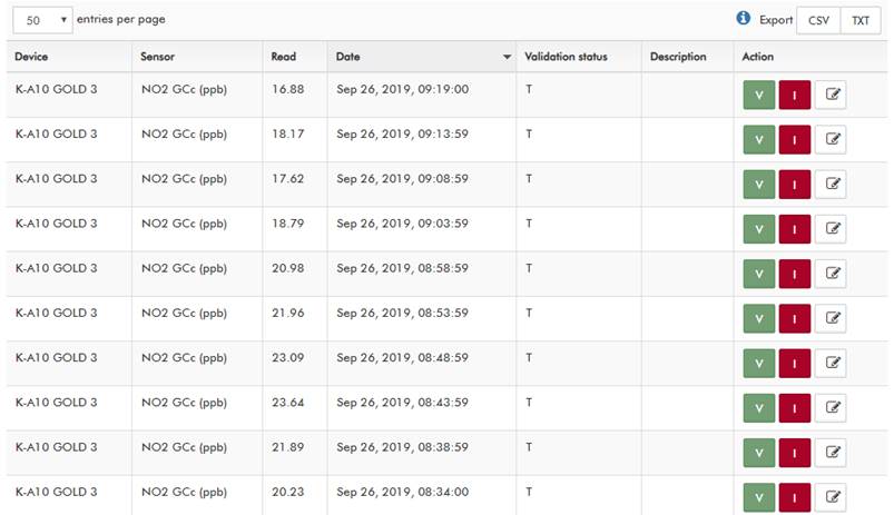
Figure 73 – Manual validation: validation table
The “V” button validates the value, “I” invalidates the value, and the pencil icon allows to modify (correct) the stored data point value. Upon clicking on those buttons different popups will be shown:
· V (validate): additional description can be entered.

Figure 74 – Validate a single data point
· I (invalidate): select a reason for this validation.

Figure 75 – Invalidate a single data point
· Pencil icon (correct): a new value must be entered to update the stored sensor reading.

Figure 76 – Correct a single data point
Once a sensor reading has been validated, it will be filtered accordingly in the standard data (Data > Standard), advance data (Data > Advanced), and reports (Tools > Reports) services.
3.6.1.1.3 Validation log
This section shows historical information of the validation processes: when (date when the validation happened), who (user responsible for validating data), what (sensor, type of validation, date range) and how (optional description). Information is shown in a table where each row represents a validation process applied to data in a certain period.

Figure 77 – Validation log’s home
There are two main blocks:
· Validation filter: a set of selectors to filter information based on device, sensor, periods, time zone and account.

Figure 78 – Validation log: filter
· Historical data table: it contains information on every filtered validation process.
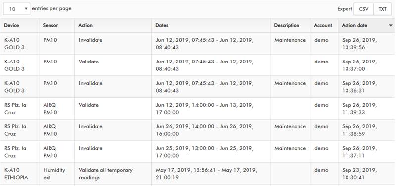
Figure 79 – Validation log: historical data table
3.6.2 Reports
With this service, it is possible to create complete reports containing a detailed analysis of different sensors of a device or a set of devices. To access it, browse to “Tool > Reports”.
There are two types of reports: single device and network (set of devices). Single device reports will show detailed information of the requested sensors of the device while network reports will allow detailed comparison between the same sensors in different devices.

Figure 80 – Creating a single device report: device, sensor and sections selection
First of all, the device and the sensors to be analyzed must be selected. Any sensor set can be selected: from one to all the sensors of the device.
The available sections in the report will depend on the device type (K-1xx, KunakAIR, KunakNoise, KunakM2M). The report can contain up to 11 sections. We will select them all.
The report will process the data included between the start and end date. Both dates must be entered along with their time zone (by default, the time zone selected will be the one configured in the device).
If the validation service is enabled in the current account, it is possible to filter the type of data points (temporary + validated data, validated data or all data) to include in the report.
3.6.2.1 Report generation
Creating a report is a complex task that can take up to several minutes depending on the amount of data (selected devices, sensors and period). Every account can only generate one report at the same time: the generation of a new report will be blocked until the report under generation has been completely created.
Once a report has been generated, it will create a notification. To download the report, you must access the report management section.

Figure 81 – Generated report notification
3.6.2.2 Report limits
At the moment the perfimission to generate reports is limited to 10 reports per account.
3.6.2.3 Report customization

Figure 82 – Customization form
The report name is optional in both the device and network reports. If no name is entered, a PDF file with a name following the format “{device name}_{device serial number}_{start date}-{end date}” will be available in the “Download reports” as soon as the report has been generated. Additionally, the network report must include a network name in the header (the network name is mandatory to identify the file):
![]()
Figure 83 – Customization network name
The style of the report can be customized: a custom cover and header can be uploaded so the file has a corporative look. The report title can be omitted so the customer can use a full styled cover with customized fonts, colors, company logo, name, etc. For example, we are going to use a large image with a resolution of 2500 * 1667 pixels as the cover and edit it including a company logo and a report title (omitting, thus, the title option):

Figure 84 – Report customization: original custom cover
The cover will look this way after being adapted to the DIN A4 format:

Figure 85 – Report customization: final custom cover
Pay attention to the resolution of the loaded images to follow the rules of your corporative image (aspect ratios, colours, fonts…).
If no customization is done, the default cover of a report will be like follows:

Figure 86 – Report customization: default cover
The header of every page can be customized too. We will use the following image:

Figure 87 – Report customization: custom logo
It will be resized and appear at the top right of every report page.

Figure 88 – Report customization: custom header
If no header is selected, a default one will be shown:
Figure 89 – Report customization: default header
With the mentioned settings and customization, we will create a report by clicking on “Generate”.
3.6.2.4 Device report
A device report is structured as follows:
· Device basic information: optional. It includes manufacturing information, location and a list of sensors with timing and threshold configurations.

Figure 90 – Device report: device basic info
· Device state analysis: optional. It includes advanced statistics of the evolution of the internal sensors (the battery, signal, and charge for wireless devices) along the period requested.
· Sensor analysis: mandatory. The content depends on the selected sensors and shows detailed information about them. It contains several points:
o Summary: some common statistics like means, maximum and minimum values, and percentiles of the selected sensors. KunakAIR devices will show additional statistics.

Figure 91 – Summary Kunak standard device

Figure 92 – Summary KunakAIR device
o Environmental analysis: advanced statistics of environmental conditions. Only available for Kunak devices with the following sensors: external temperature, relative humidity, atmospheric pressure.
o Sensor analysis: advanced statistics of the requested sensors (gases and particles, noise, analog/digital input/outputs). The environmental sensors (external temperature, relative humidity, atmospheric pressure, wind direction and speed), if requested, will be shown at the beginning of the section to describe the context where the analysis was carried out.
3.6.2.5 Network report
A network report is structured as follows:
· Device basic info: mandatory. A set of tables showing the selected sensors per device.

Figure 93 – Network report: device basic info
· Device state analysis: optional. It includes advanced statistics of the evolution of the internal sensors (the battery, signal, and charge for wireless devices) along the period requested.
· Sensor analysis: mandatory. The content depends on the selected sensors and shows detailed information about them. It contains several points:
o Summary: some common statistics like means, maximum and minimin values, and percentiles of the selected sensors. KunakAIR devices will show additional statistics.
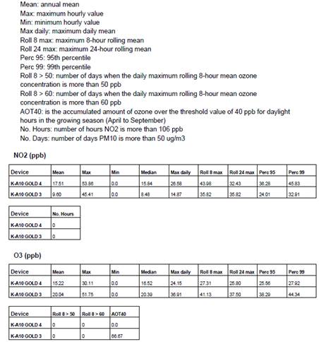
Figure 94 – Network report: sensor summary
o Environmental analysis: advanced statistics of environmental conditions. Only available for Kunak devices with the following sensors: external temperature, relative humidity, atmospheric pressure.
o Sensor analysis: advanced statistics of the connected sensors (gasesand particles, noise, analog/digital input/outputs).
When selecting exactly 2 devices, scatter plots will be available to compare the same sensor from both devices.
3.6.2.6 Advanced statistics
The advanced statistics contained in the “Device state analysis” and “Sensor analysis” consist of the same set of charts (time variation, time plot, correlation matrices, bar plots…). This set depends on the analysis selected in the “Tools > Reports > Create report” section.
The following sections show an example of every chart with a simple explanation.
3.6.2.6.1 Time plot
It shows the hourly average (y-axis) of a single sensor along the requested period (x-axis).
The time span depends on the requested period in the “Create report” section.

Figure 95 – Advanced analysis: time plot
In the above image, we can see that the average NO2 concentration for the month has not exceeded 50 ppb.
3.6.2.6.2 Calendar plot (daily average)
It shows the evolution of a sensor readings in time using a calendar to represent the value of a statistical parameter in color scale, based on a daily aggregation. The daily average is calculated using the 24 hourly averages.
Multiple months can be represented depending on the requested period in the “Create report” section.

Figure 96 – Advanced analysis: calendar plot (daily average)
In the above image, we can see that the second Sunday of the month has been the worst in terms of average NO2 concentration: 15 ppb.
3.6.2.6.3 Calendar plot (maximum hourly average)
It shows the evolution of a sensor readings in time using a calendar to represent the value of a statistical parameter in color scale, based on a daily aggregation. The maximum hourly average is calculated by selecting the maximum value among all of the hourly averages (24 in total).
Multiple months can be represented depending on the requested period in the “Create report” section.

Figure 97 – Advanced analysis: calendar plot (maximum hourly average)
In the above image, we can see that the third Wednesday of the month is the one with the highest peak in terms of NO2 concentration: 60 ppb.
3.6.2.6.4 Scatter plot
It allows to check how two sensors are related to each other disaggregating results based on their hourly averages.
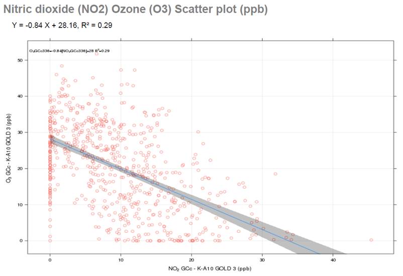
Figure 98 – Advanced analysis: scatter plot
In the above image, we can see that there is a low correlation (R2=0.29) between the NO2 and O3 concentrations. O3 can be approximated using the linear regression formula O3 = -0.84 * NO2 + 28.16. The blue line represents this formula while the grey area represents the 95% confidence interval limits.
3.6.2.6.5 Time variation
It allows analyzing the variation of a statistical parameter of a sensor readings concerning different cyclic periods (hours within days of the week, hours, month, and days of the week), thus establishing patterns of the behavior of the parameter in the study area.

Figure 99 – Advanced analysis: time variation plot
The thick lines/points represent the hourly average, while the coluored areas represent the 95% confidence intervals:

Figure 100 – Hourly average and 95% confidence intervals
3.6.2.6.6 Bar plot
This chart shows a simple comparison between the monthly average values of different sensors sharing the same unit (ppb, °C, %...). Since there is a bar per each month for every sensor, two analyses can be done: different months for the same sensor and the same month for different sensors.

Figure 101 – Advanced analysis: bar plot
3.6.2.6.7 Pollution rose
This graph shows the relationship between a sensor reading and the way the wind was blowing at the moment of capturing this reading.
The chart area is divided into 4 sectors (W-N, N-E, E-S, S-W) of 90° each one divided into 4 slices of 30°, 30°, 15° and 15°. There are, in total, 12 slices of 30° with each slice containing multiple ranges of sensor values.
Grey circles represent the percentage of time the wind has been blowing in the way indicated by each slice.
The values of the ranges are based on hourly averages.

Figure 102 – Pollution rose: advanced analysis
3.6.2.6.8 Polar plot
This graph shows the relationship between a sensor reading and the way and speed of the wind at the moment of capturing this reading.
The chart area is divided into 4 sectors (W-N, N-E, E-S, S-W) where a mathematical model smoothes the grid and ends up providing a continuous surface
Grey circles represent the wind speed in m/s.
The values are based on hourly averages.

Figure 103 – Advanced analysis: polar plot
3.6.2.6.9 Correlation matrix
It shows as a result a matrix with the correlation of the hourly averages of the different sensors selected. If the inclination pattern of the ellipse is like "/", then the correlation is directly proportional. On the other hand, if the correlation follows the "\" pattern, then it is inversely proportional. The ellipse will be more or less flattened according to the strength of the correlation. There are several key parameters for this type of plot:

Figure 104 – Advanced analysis: correlation matrix
3.6.2.7 Report management
This is the place to manage the already created reports. Reports are classified into 2 tree views depending on the report type: device and network report. Two actions are available per report: download and delete. Since there is a limit to the number of reports an account can store at the same time in Kunak Cloud, it is recommendable to delete them once they have been downloaded.

Figure 105 – Report management
It is possible to filter reports using device serial number, device tag, network tag or the dates entered at the time of its creation:
![]()
Figure 106 – Report management: filter reports
To download a report, just click on the
icon ![]() .
.
To delete a report, just click on the icon ![]() .
.
3.6.3 Import Data
Virtual devices can be ordered to Kunak and can be used to import and visualize in Kunak Cloud every type of data, for instance environmental reference stations data. To import data to a pre-ordered virtual device, go to “Tools > Import Data”.
In order to upload data, the following process must be followed:
The user must ask Kunak for a virtual device to be able to upload data to the cloud.
In the import data tool, select the virtual device that the data will be uploaded.
Select the .csv file to be upload with the following name format: “<serial number of the device to upload data>_<Creation date>.csv”. For example, virtual device serial number 00000000 the file name will be the following "00000000_20200312080000.csv".
Check that the data is correct.
Click on finish and the data will be processed and uploaded to Kunak Cloud.

Figure 107 – Import data
3.6.3.1 CSV format
As mentioned in the previous section, the first thing that must be fulfilled is the file name format “<serial number of the device to which the data is to be uploaded>_<Creation date>.csv”.
In addition, the following requirements must be met:
· Column separator ';' and the '.' as decimal separator.
· The following columns:
o The first column mus be called date using the format 'yyyy-mm-dd hh:mm:ss' and be in UTC
o For each sensor you must have the following columns:
§ <sensor name>_value_<unit>: sensor value.
§ <sensor name>_flag: value validation flag. It can have the following values V (valid), I (invalid) and T (temporary). If this column is empty, the flag will set by default in T.
For example, if you have a sensor that measures the level of a river and you measure in meters, you want to call the sensor 'level' and the unit 'm', the value columns would have the following name 'level_value_m' and the validation flag 'level_flag'.
If you want to upload air quality data in the same format as Kunak Cloud, the following column names should be used:
|
Parameter |
Unit |
Value column name |
Validation flag column name |
|
CO |
ppb |
CO GCc_value_ppb |
CO GCc_flag |
|
CO |
ug/m3 |
CO GCc_value_ug/m3 |
CO GCc_flag |
|
NO2 |
ppb |
NO2 GCc_value_ppb |
NO2 GCc_flag |
|
NO2 |
ug/m3 |
NO2 GCc_value_ug/m3 |
NO2 GCc_flag |
|
NO |
ppb |
NO GCc_value_ppb |
NO GCc_flag |
|
NO |
ug/m3 |
NO GCc_value_ug/m3 |
NO GCc_flag |
|
NOx |
ppb |
NOx GCc_value_ppb |
NOx GCc_flag |
|
NOx |
ug/m3 |
NOx GCc_value_ug/m3 |
NOx GCc_flag |
|
O3 |
ppb |
O3 GCc_value_ppb |
O3 GCc_flag |
|
O3 |
ug/m3 |
O3 GCc_value_ug/m3 |
O3 GCc_flag |
|
SO2 |
ppb |
SO2 GCc_value_ppb |
SO2 GCc_flag |
|
SO2 |
ug/m3 |
SO2 GCc_value_ug/m3 |
SO2 GCc_flag |
|
H2S |
ppb |
H2S GCc_value_ppb |
H2S GCc_flag |
|
H2S |
ug/m3 |
H2S GCc_value_ug/m3 |
H2S GCc_flag |
|
PM10 |
ug/m3 |
PM10_value_ug/m3 |
PM10_flag |
|
PM2.5 |
ug/m3 |
PM2.5_value_ug/m3 |
PM2.5_flag |
|
PM1 |
ug/m3 |
PM1_value_ug/m3 |
PM1_flag |
Table 7 – Name of sensors to be uploaded
The following names will be used for the meteorological data:
|
Parameter |
Unit |
Value column name |
Validation flag column name |
|
Temperature |
C |
Temp ext_value_C |
Temp ext_flag |
|
Relative humidity |
% |
Humidity ext_value_% |
Humidity ext _flag |
|
Atmospheric pressure |
hPa |
Pressure_value_hPa |
Pressure_flag |
|
Average wind direction |
Degrees |
W Vane AVG_value_deg |
W Vane AVG_flag |
|
Average wind speed |
Km/h |
W Speed AVG_value_Km/h |
W Speed AVG_flag |
|
Maximum wind speed |
Km/h |
W Speed MAX_value_Km/h |
W Speed MAX_flag |
|
Rainfall |
mm |
Rainfall_value_mm |
Rainfall_flag |
|
Noise |
dB(A) |
LAeq_value_dB(A) |
LAeq_flag |
Table 8 – Name of meteorological data
Example of a CSV file to import data to Kunak Cloud is shown bellow.
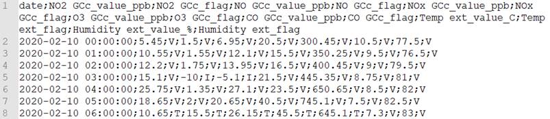
Figure 108 – CSV import data example
3.7 Notifications
This section informs about the state of the Kunak Cloud platform and your resources, services and user accounts. To access it, just click on the “Notifications” item in the navigation bar:
![]()
Figure 109 – Notification item in the navigation bar
The number close to the icon represents the number of unread notifications.
There are different types of notifications:
· Activity: notifications triggered by changes in the state of some tasks carried out by the user (e.g. generate a report).
· Service: notifications containing information about scheduled maintenance or update tasks on the platform.
· News: notifications of new service releases and updates made to the platform.

Figure 110 – Notifications menu
Each tab (“Activity”, ”Service”, “News”) shows the last notifications of a particular type. To get a detailed view of all the notifications, just click on “View all notification…" at the bottom of the content. The following section will appear:

Figure 111 – Notifications table
It is possible to filter the content of the table based on the notification type and the start and end dates. Also, you can confirm all notifications and delete some.
Upon clicking on a row, a dialog will appear:

Figure 112 – Notification dialog
This dialog includes a detailed description of the issue.
To confirm the reading of this
notification, click on “Confirm”. The row will change the status from unread ( ![]() ) to read (
) to read ( ![]() ).
).
In some notifications the “See” button appears, this allows to go directly to the resource where the notification indicates.
3.8 Help and Support
In the “Support” area of the Kunak Cloud web, located at the top-right of the web, it can be found the last versions of all the products of Kunak.
Contact [email protected] for any kind of problem with Kunak Cloud: account/permission problems, bugs or improvement suggestions.

Figure 113 – Help menu
3.8.1 Resources
This section contains all kinds of useful resources to work with Kunak devices: links to manuals and all the software needed to configure and monitor Kunak devices available to download.

Figure 114 – Resources section

Figure 115 - Resources section II
3.8.2 Change log
There is a change log at the bottom of the section that keeps tracking of the latest updates of the platform. Check it whenever you want to know the new features added to the platform:

Figure 116 – Change log
By default, only the last updates are shown. To load more updates, click on “View more…”.
To access a more detailed view of an update, click on “View details” on the right of every log input. A new tab with the update description is open:

Figure 117 – Changelog: detailed update information
3.9 User settings and Management
This section allows to edit typical user settings like authentication and contact information and preferences related to language, visualization, and data format.
3.9.1 User Settings
3.9.1.1 Account information
· Authentication and permissions: the ID of the currently logged-in account and its permissions. This information is not editable.
· Organization information: information about the organization (if any) the owner of the account belongs to. This information is only editable for accounts of type distributor or manufacturer.
· Account information: contact information including the email used for alarm notifications.
· Service limits: some restrictions applied to the account and managed by the root account which created the current account.

Figure 118 – User settings: account information
3.9.1.2 General preferences
· General preferences: the language of the web application. All the information will be translated to the one selected. There are currently two languages available: Spanish and English.
· Visualization preferences: select the default visualizations preferences applied to all the cloud for the current account.
· Export Preferences: select the default data from the table preferences (separator formatting and date order)
3.9.1.3 Security changes
It lets the user change the password of the account.

Figure 119 – User settings: security
3.9.1.4 Email notifications
The emails notifications that you can recibe can be configured:
· Threshholds warnings: Activate or deactivate the sending of emails when a threshold warning is generated. You can select the devices from which you want to receive emails.
· Operation alarms: Activate or deactivate the sending of emails when a operation alarm is generated. You can select the devices from which you want to receive emails.
· Activity notifications: Activate or deactivate the sending of emails when an activity notification is generated.
· Services notifications: Activate or deactivate the sending of emails when an service notification is generated.
· News notifications: Activate or deactivate the sending of emails when an news notification is generated.
You can also add up to 5 different emails to receive the notifications set up in your account.

Figure 119 – Email notifications
3.9.2 Accounts
Accounts hierarchy is explained in 2.6 Profiles and Packages section. All accounts must be previously purchased from the distributor or from Kunak. Once purchased, you will be given an Item number that can be used to create an account of the type acquired.
![]() Only Admin account (the organization manager) can access to this
section by going to the top-right corner and selecting it.
Only Admin account (the organization manager) can access to this
section by going to the top-right corner and selecting it.
A single device can be shared by multiple accounts whose assigned permissions will condition the way devices can be managed (get data, update configurations, check alarms…).
The section can be found at “{Your user name} > Accounts”.
Figure 120 – Accounts tool access
3.9.2.1 Consult and edit account
It is possible to edit the identification and the contact info of all the accounts created/managed by the currently logged-in user.
An account can be deleted by clicking on “Delete” at the top right corner.
![]() Be careful! All the accounts of users and clients linked to the account being
deleted will be lost.
Be careful! All the accounts of users and clients linked to the account being
deleted will be lost.
A useful selector at the top of the section allows searching by account ID (the ID used to log into Kunak Cloud) or by Business Name (the real name of a company stored in Kunak Cloud).
The information that can be consulted are:
- Organization information: Type of account and its item associated, contact information (address, email, name, even telephone number) of the person in charge, CIF (useful only for Spanish companies, any value will be valid). This information will be replicated for all the accounts of type Viewer or Expert, the final level, in the account hierarchy) belonging to the currently logged in account.
· Account information: contact information of the owner (the user) of the account.
· Organization service limits: Period of validity of the Item related to the account.
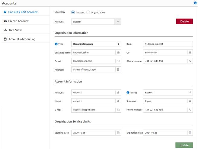
Figure 121 – “{Your user name} > Accounts > Consult/Edit account”
The following account settings can be edited:
· Organization information: contact information (address, email, name, even telephone number) of the person in charge, CIF (useful only for Spanish companies, any value will be valid). Only can be changed of an Admin account.
· Account information: contact information of the owner (the user) of the account.
3.9.2.2 Create an account
In order to help with the process of creating a new account, you will have to follow the steps of the wizard.
1. Create the new account.
2. Link the devices to the new account.
3. If there are extra services to be added they can be added too.
At any time after the creation of the account, you can:
· Edit the information of the account, see section 3.9.2.1 Consult and edit account.
· Link or unlink devices to the account, see section 3.9.3.1 Link and Unlink devices

Figure 122 – “{Your user name} > Accounts > Create account”
When creating an account, it is needed to have an empty item provided by the distributor or Kunak. When the empty item is selected, the permissions for the account will be automatically applied.
After selecting an item, authentication info (user + password) and contact information must be set:
· Organization information: contact information (address, email, name, even telephone number) of the person in charge, CIF (useful only for Spanish companies, any value will be valid). This information will be replicated for all the accounts of type “final user” (level 4, the final level, in the account hierarchy) belonging to the currently logged in account.
· Authentication: user and password.
· Account information: contact information of the owner (the user) of the account.
· Service limits: information about the period of validity of the item.
3.9.2.3 Accounts Tree view
This section shows a simple tree with the organization of the Kunak Cloud based on accounts managed by the currently logged-in account.

Figure 123 – “{Your user name} > Accounts > Tree view”
Every account node shown in the tree contains the devices and the accounts linked to it. To help, the “Profile” of each account and the “Packages” are displayed.
3.9.2.4 Actions log
Multiple user actions are registered in Kunak Cloud. This can be useful to find out why a device is not working as intended (wrong configuration andwho applied it) or to know usage patterns.
User actions are shown in a paginated table and they can be ordered by date. By default, the last actions will be shown without any kind of filtering.

Figure 124 – “{Your user name} > Accounts > Accounts Actions log”
There are two groups of actions:
· Device actions: all kind of stuff related to a device (registration, configuration, link/unlink device to/from sub-user, confirm alarms)
· User actions: actions associated with user management (create/edit/delete users) and that do not include devices.
The action filter contains the following inputs:
· User actions: select one or more available user actions to be filtered.
· Devices actions: select one or more device actions to be filtered.
· User: target user to be filtered (current user, all users or a single user).
· Time zone: the time reference for all the dates.
· Period: start and end date of the actions to be filtered.
Click on “Apply” to filter the user actions based on the requested parameters in the filter.
3.9.3 Devices
A simple section that allows basic device operations like linking/unlinking devices or managing them.
![]() Only Admin account (the organization manager) can access to this
section by going to the top-right corner and selecting it.
Only Admin account (the organization manager) can access to this
section by going to the top-right corner and selecting it.
The section can be found at the “{Your user name} > Accounts”.

Figure 125 – “{Your user name} > Devices”
3.9.3.1 Link and Unlink devices
This section allows the link or unlink of devices to sub-accounts. It is only accessible by an admin account.

Figure 126 – Link devices
Link devices to an account:
To start, a target user must be selected in the “User” selector and then assign the desired devices to this user and choose “Link”. For the chosen “User”, the packages associated with the devices can be modified so the user has less or the same permissions as the currently logged (never more). At “Dates of access to information”, it can be selected from when the selected “User” can access to the data of the device and the end date if required.
Finally, press the “Update” button to complete the action.
Unlink devices to an account:
Select the target “User” that you want to unlink the devices. A list of the linked device will appear, and select the device you want to unlink. To confirm, press “Update” button.
3.9.3.2 Device management
This section allows to view and manage the information of the devices already associated with the current account and those shared with the organization's accounts.
There are two types of view in depending on the account selected:
· Current account logged in: it will only allow to consult packages and the period of access to the info of the devices acquired.
· The rest of the accounts of the organization: view and edit the packages and period of access to the information of the devices linked to that accounts.

Figure 127 – Device management
3.9.3.3 Devices Tree view
This section shows a simple tree with the organization of the Kunak Cloud platform based on devices managed by the currently logged-in account. Every device node shown in the tree contains the accounts that have access to it.

Figure 128 – “{Your user name} > Devices > Tree view”
3.9.4 Billing
This section allows to consult and manage all the contracted products.
![]() Only Admin account (the organization manager) can access to this
section by going to the top-right corner and selecting it.
Only Admin account (the organization manager) can access to this
section by going to the top-right corner and selecting it.

Figure 129 – “{Your user name} > Billing”
The term Item is used to name all the products or services that have been hired. The items are unique in such a way that can be easily associated what is billed with its status in the cloud.
The types of items that a client can hire are:
· Account: minimum of 1 admin account is needed to access to the cloud
o Organization: Admin
o User: Expert and Viewer
· Devices: the products connected to the cloud
· Extras: normally will be services associated to accounts or devices
An item goes through different stages depending on its status. When an item is created, its status will appear as "pending invoice". When the invoice is created, it will change to "invoiced" and once the invoice for that item has been paid, its status will change to "paid".
This payment will correspond to a specific period of time in which the payment is valid. One month before the end of the contracted period, an email will be sent to the main account notifying the product/item expiration, while the status of the item will change to "Expires soon". If there is no renewal process, a new email will be resent 5 days before the expiry date. To renew your product, you must contact your distributor or, in case of any problem, contact Kunak directly.
If the item has not been renewed before its end date, an email will be sent to the customer notifying about the expiry of the product, its status will change to "not renewed" and the service will be cancel.
The state flow that follows an item, according to the status in which it is found, is detailed below.

Figure 130 – Diagram of states through which an item pass
3.9.4.1 Manage Subscription
The summary and management of all the purchased products and services can be found in this section. This section is useful to know the price of the purchased products.

Figure 131 – Manage subscription
The information that can be managed is divided into: Organizations, Users, Devices and Extras. For each category the available information is the following:
· Organizations, Users, Extras:
o Item: The unique number that identifies the purchased product.
Type: Type of the item. It can be “manufacturer”, “distributor”, “final client” or “user” in the case that the item is for an account or “extra” for the cases of extras items purchased.
o Profile: Account classification. Can be “Admin”, “Expert”, “Viewer”.
o Item Owner: Account owner of the item and can consume it. It can be only changed when the item is not assigned to an account (the item is not used).
o Assigned account: Account that is consuming the item. It can only be changed in "Extras" items. To assign an account to an item, it must be done in the "Account" section by selecting the item.
o Devices: the devices to which the item applies.
o Start/End billing date: period in which the item is valid/available/hired.
o Base Price, discount, VAT, price: The amount of the item.
o Status: The administrative status of the item.
o Note: Help to identify each item.
· Devices:
o S/N: Unique number that identifies the purchased devices. It is the item number for devices.
o Tag: Name of the device for the account selected. Each account can have a different tag name for each device.
o Package: The packages associated with a device in the selected account. All the devices connected to the cloud have at least the starter package and any additional packages can be added to them.
o Owner: Account or accounts who own that device.
o Starting/Expiration date: period in which the item is valid/available/hired.
o Base Price, discount, VAT, price: The amount of the item.
o Status: The administrative status of the device.
Every item has an owner, and this owner can be changed except if an account is assigned to that item. This is useful when a distributor purchases for instance, 3 “User” items that can be assigned to a final client. Firstly, the owner would be the distributor, and these 3 items do not have an account assigned yet. When the 3 “User” items are assigned to the final client, the owner of the items will change, and the final client will be able to create an "User" account from each of the “User” items.

Figure 132 – Billing change of item owner
To change the Item owner, go to the pencil of the item and change it at the window that will appear.

Figure 133 – Manage the owner of an item
The extra item related to an account that will benefit that account, for instance, the “Extra API Call”, can be edited at any moment. Clicking at the pencil in the row of the “Extra” item that you want to manage.

Figure 134 – Change “assigned account” of an extra
3.9.4.2 Overview
It is a simple way to see how much of the purchased products have been consumed. This tool will help the "Admin" to know how many items are being used, how many are available, and how many API calls each account uses. By selecting the different accounts with the selector box, it is possible to consult the items associated with that account.
The items used by accounts are shown in the sections “Organizations” and “Users”. At the header of each section is shown how many items are used of the total available.

Figure 135 – Billing overview: Organizations and users
A brief of the packages associates with the devices of the selected account is displayed in the “Devices” section.

Figure 136 – Billing overview: Devices
The API call section shows the amount of extra “API call packages” hired and linked to each account. Below, the quantity of API calls used by month and account. These values are interesting to know the required “API call packages”.

Figure 137 – Billing overview: API calls consumption
3.9.4.3 Bill History
The Admin account shows the history of your invoices emitted and their status.

Figure 138 – Billing history
By clicking on “Document Id” or the icon ![]() , it will download a PDF of
the invoice.
, it will download a PDF of
the invoice.
The status of each invoiced can change between “Pending” or “Paid” according to their current situation.
3.9.4.4 Due Date
This section shows a quick search of items (related to accounts, devices or extras) that are going to expire soon, have not been paid (invoiced but not paid), or pending invoices.

Figure 139 – Billing Due Date
3.9.5 Log Out
The current session can be logged out at any time by going to the “{Your user name} > Log Out”.

Figure 140 – Session log out
4. ADMINISTRATOR TOOLS
4.1 Create a new account
This section shows the steps that must be followed to create a new account at Kunak Cloud.
![]() Note: Only an “Admin” account can create
new accounts.
Note: Only an “Admin” account can create
new accounts.

Figure 141 – Diagram to create a new account
The steps are:
1. Loggin at kunakcloud with your “Admin” account.
2. Free item not used of the type required.
To create a new account it is necessary to have a free item. It is possible to find out if there are any new items by logging in to the cloud and going to:
· “{Your user name} > Accounts > Create Account”. Only free items will be shown.

Figure 142 – Find free items from “Create Account”
· “{Your user name} > Billing > Manage Subscription”. In the sections "Organisations" and "Users" all items of the account can be found. Those items in these tables where the field "assigned account" is empty, are free to be used.

Figure 143 – Find free items from “Manage subscription”
3. Create the account.
At “{Your user name} > Accounts > Create Account” select the free item of the type that is desired to be create and fill in all requested fields.
![]() Note: Be careful to save the password so
that you can send it to the person who is going to use it.
Note: Be careful to save the password so
that you can send it to the person who is going to use it.
4. Associate the devices to the new account.
At “{Your user name} > Devices > Link/Unlink Devices” select the account created in the previous step, the “action” is “link” and select all the devices to be linkded to that account. Both the "date of access to information" of the devices and the "packages" associated with that device and account, may be different from those of the main account (the same or less).
5. Add Extras to the account.
In the case that the new account need to be
linked with some “extras” items as, for example, extra API calls; it can be
done at “{Your user name} > Billing > Manage Subscription”. There, open
the extas section and edit the “Extra” Item to manage by clincking ![]() . Then select the
“Assigned account” to that “extra” item to the to the newly created account.
. Then select the
“Assigned account” to that “extra” item to the to the newly created account.

Figure 144 – Assign account to an “Extra” Item
5. ADVANCED AIR QUALITY ANALYTICS SERVICE
Kunak devices and platforms are focused on 4 main fields: Air Quality, M2M, Industry 4.0 and Utilities management. For each one of those fields, the cloud platform could offer some specific functionalities which will be explained in the following sections.
![]() Only devices with the “Advanced Air Quality Analytics” package will
show their AQI colour.
Only devices with the “Advanced Air Quality Analytics” package will
show their AQI colour.
This is an optional service offered in Kunak Cloud with additional features:
· Air quality index calculation: the air quality index is the reference parameter used to evaluate the air quality in different environments.
· Calculation of pollutants that affect the air quality index: the air quality index calculation is based on moving averages of several gases or particle pollution. For every air quality index value, the predominant pollutant and those moving averages are registered.
· Home dashboard adapted to air quality: the home dashboard is transformed into a detailed air quality dashboard that allows advanced analysis of the evolution of the air quality index and its pollutants.
· Specific advanced air quality index charts: additional charts in the “Data > Advanced” section.
This service comes at an additional cost as an additional package of a Kunak device. To enable it for your admin account, contact [email protected]. If the service is already available for a admin account, it is possible to enable/disable it for all the accounts being managed from that admin account. To enable/disable it, browse to “{Your user name} > Devices > Device Management”, selecting the account, editing the device and check/uncheck the “permission”:

Figure 145 – Enable/disable air quality analytics service
5.1 Air quality index
Air quality is measured by a parameter called Air Quality Index (AQI). The calculation of this parameter varies from one country to another. The cloud platform shows two air quality indexes, one provided by the United States Environment Protection Agency and the other by the European Environment Agency. By default, the one provided by the European Environment Agency is selected.
"An air quality index (AQI) is a number used by government agencies to communicate to the public how polluted the air currently is or how polluted it is forecast to become. As the AQI increases, an increasingly large percentage of the population is likely to experience increasingly severe adverse health effects. Different countries have their own air quality indices, corresponding to different national air quality standards." [Wikipedia]
It is possible to select the preferred AQI by browsing to the “{Your user name} > User Setings > General” section on the top right of the web:

Figure 146 – Default AQI selection
Besides the default air quality index, the default gas unit for gas sensors can be edited in the same place.
5.1.1 AQI levels European Environment Agency
Measurements of up to five key pollutants (O3, NO2, SO2, PM10, PM2.5) determine the index level that describes the current air quality situation at the location of each Kunak device. The index corresponds to the poorest level for any of the five pollutants based on the following scheme:
|
Pollutant |
Level index (based on pollutant concentrations in µg/m3) |
|||||
|
Good |
Fair |
Moderate |
Poor |
Very poor |
Extremely poor |
|
|
(0-25) |
(26-50) |
(51-75) |
(76-100) |
(101-125) |
(126-200) |
|
|
PM2.5 (24h) |
0-10 |
10-20 |
20-25 |
25-50 |
50-75 |
75-800 |
|
PM10 (24h) |
0-20 |
20-35 |
35-50 |
50-100 |
100-150 |
150-1200 |
|
NO2 |
0-40 |
40-90 |
90-120 |
120-230 |
230-340 |
340-1000 |
|
O3 |
0-50 |
50-100 |
100-130 |
130-240 |
240-380 |
380-800 |
|
SO2 |
0-100 |
100-200 |
200-350 |
350-500 |
500-750 |
750-1250 |
Figure 147 – AQI levels: EEA
The colour scheme is provided to give information on the status of the Kunak devices. The grey markers indicate the stations for which insufficient data have been reported or data has not been reported in order to calculate the index.

Figure 148 – Different markers representing the AQI
Air quality index follows the function:
![]()
Where:
![]() the
(Air Quality) index
the
(Air Quality) index
![]() the
pollutant concentration
the
pollutant concentration
·
![]() the
concentration breakpoint that is
the
concentration breakpoint that is ![]()
·
![]() the
concentration breakpoint that is
the
concentration breakpoint that is ![]()
·
![]() the
index breakpoint corresponding to
the
index breakpoint corresponding to ![]()
·
![]() the
index breakpoint corresponding to
the
index breakpoint corresponding to ![]()
Assume that a monitor records a 24-hour average fine particle (PM2.5) concentration of 12.0µg/m3. The equation above results in an AQI of:
![]()
5.1.2 AQI levels United States EPA
AQI levels of the United States Environment Protection Agency (EPA). Measurements of up to six key pollutants (O3, NO2, CO, SO2, PM10, PM2.5) determine the index level that describes the current air quality situation at the location of each Kunak device. The index corresponds to the poorest level for any of the six pollutants based on the following scheme:
|
Pollutant |
Level index (based on pollutant concentrations in µg/m3) |
|||||
|
Good |
Moderate |
Unhealthy for Sensitive Groups |
Unhealthy |
Very unhealthy |
Hazardous |
|
|
(0-50) |
(51-100) |
(100-150) |
(150-200) |
(201-300) |
(301-500) |
|
|
PM2.5(24h) |
0-12 |
12.1-35.4 |
35.5-55.4 |
55.5-150.4 |
150.5-250.4 |
250.5-500.4 |
|
PM10(24h) |
0-54 |
55-154 |
155-254 |
255-354 |
355-424 |
425-604 |
|
NO2 (1h) |
0-99.6 |
99.7-188 |
188.1-676.8 |
676.9-1220.1 |
1220.2-2348.1 |
2348.2-3852.1 |
|
O3 (8h) |
0-108 |
109-140 |
140-210 |
211-400 |
- |
- |
|
O3 (1h) |
- |
- |
250-328 |
329-408 |
409-808 |
809-1208 |
|
SO2 (1h) |
0-91.7 |
91.8-196.5 |
196.6-484.7 |
485.8-796.4 |
- |
- |
|
SO2(24h) |
- |
- |
- |
- |
799.1-1582.4 |
1582.5-2630.4 |
|
CO (8h) |
0-5038 |
5039-10763 |
10764-14198 |
14199-17633 |
17633-34808 |
34809-57708 |
Figure 149 – AQI levels: USA EPA
The color scheme is provided to give information on the status of the Kunak devices. The gray markers indicate the stations for which insufficient data have been reported or data has not been reported in order to calculate the index.
Air quality index follows the function:
![]()
Where:
![]() the
(Air Quality) index
the
(Air Quality) index
![]() the
pollutant concentration
the
pollutant concentration
·
![]() the
concentration breakpoint that is
the
concentration breakpoint that is ![]()
·
![]() the
concentration breakpoint that is
the
concentration breakpoint that is ![]()
·
![]() the
index breakpoint corresponding to
the
index breakpoint corresponding to ![]()
·
![]() the
index breakpoint corresponding to
the
index breakpoint corresponding to ![]()
Assume that a monitor records a 24-hour average fine particle (PM2.5) concentration of 12.0 µg/m3. The equation above results in an AQI of:
![]()
5.1.3 AQI level Custom
The European and USEPA AQI are always calculated but in addition a third AQI can be calculated for a device. To start calculating the custom AQI a device must be configured for it as explained at 3.4 Configuration section.
![]() The custom AQI will start to be calculated from the moment this
setting is saved until it is changed.
The custom AQI will start to be calculated from the moment this
setting is saved until it is changed.
From the section "User Settings > General > Visualization Preferences" you can change the AQI to be displayed in the application. See 3.9.1.2 General preferences for more info.
The current customs AQI that can be calculated are described below. If you whant your own AQI to be calculated, you must write to [email protected] and send all the information about your AQI.
5.1.3.1 India AQI
Coloured markers represent the locations of the devices. The colour indicates the level of air quality based on the Air Quality Index (AQI) at a given moment indicated by the time scroll bar located at the bottom of the page.
AQI is based on the values of up to seven key pollutants (O3, CO, NH3, NO2, SO2, PM10, PM2.5) to determine the degree of air pollution at the location of each device. The index corresponds to the poorest level of any of the seven pollutants based on the following ranges.
|
Pollutant |
Level index (based on pollutant concentrations in µg/m3) |
|||||
|
Good |
Satisfactory |
Moderate |
Poor |
Very Poor |
Severe |
|
|
(0-50) |
(51-100) |
(101-200) |
(201-300) |
(301-400) |
(401-500) |
|
|
PM2.5 (24h) |
0-30 |
31-60 |
61-90 |
91-120 |
121-250 |
> 250 |
|
PM10 (24h) |
0-50 |
51-100 |
101-250 |
251-350 |
351-430 |
> 430 |
|
NO2 (24h) |
0-40 |
41-80 |
81-180 |
181-280 |
281-400 |
> 400 |
|
O3 (8h) |
0-50 |
51-100 |
101-168 |
169-208 |
- |
- |
|
O3 (1h) |
- |
- |
- |
- |
209-748 |
> 748 |
|
NH3 (24h) (mg/m3) |
0-0.2 |
0.2-0.4 |
0.4-0.8 |
0.8-1.2 |
1.2-1.8 |
> 1.8 |
|
SO2 (24h) |
0-40 |
41-80 |
81-380 |
381-800 |
801-1600 |
> 1600 |
|
CO (8h) |
0-1000 |
1001-2000 |
2001-10000 |
10001-17000 |
17001-34000 |
> 34000 |
Table 9 – India AQI
5.1.3.2 Spain AQI
Coloured markers represent the locations of the devices. The colour indicates the level of air quality based on the Air Quality Index (AQI) at a given moment indicated by the time scroll bar located at the bottom of the page.
AQI is based on the values of up to five key pollutants (O3, NO2, SO2, PM10, PM2.5) to determine the degree of air pollution at the location of each device. The index corresponds to the poorest level of any of the five pollutants based on the following ranges.
|
Pollutant |
Level index (based on pollutant concentrations in µg/m3) |
|||||
|
Good |
Fair |
Moderate |
Poor |
Very poor |
Extremely poor |
|
|
(0-25) |
(26-50) |
(51-75) |
(76-100) |
(101-125) |
(126-200) |
|
|
PM2.5 (24h) |
0-10 |
10-20 |
20-25 |
25-50 |
50-75 |
75-800 |
|
PM10 (24h) |
0-20 |
20-40 |
40-50 |
50-100 |
100-150 |
150-1200 |
|
NO2 |
0-40 |
40-90 |
90-120 |
120-230 |
230-340 |
340-1000 |
|
O3 (8h) |
0-80 |
50-100 |
100-130 |
130-240 |
240-380 |
380-800 |
|
SO2 |
0-100 |
100-200 |
200-350 |
350-500 |
500-750 |
750-1250 |
Table 10 – Spain AQI
5.2 Air quality dashboard
An advanced analysis of the AQI can be done directrly at the dashboard map by different methods.
5.2.1 Dashboard Analytics layers
What is being displayed on the map can be changed using the different layers available.

Figure 150 – AQI layer selector
Each layer has different features that will provide to the user with extra analysis of the devices being analysed.
Rembember that basics view options can be
edited from the ![]() button .See 3.1.3 Dashboard Main Content section for more info.
button .See 3.1.3 Dashboard Main Content section for more info.
5.2.1.1 AQI layer
The AQI layer shows the Air Quality Index of each device.
![]()
Figure 151 – AQI layer button
The marker colour indicates the level of air quality based on the Air Quality Index (AQI) and by clicking on the device, it appears a detail information of the AQI at a given moment indicated by the temporal scroll located at the bottom of the page.
For example, in the figure it is shown in the left device a Good value of AQI, which is due to the PM2.5 concentration, while in the right device, it is shown an Extremely poor AQI value due to PM10.


Figure 152 – AQI layer
5.2.1.2 Wind graphs layer
This layer shows the pollution roses and the mean values for each device/location at the selected date, hour and sensor. The time scroll bar located at the bottom of the page can be used to see a different pollution rose from one hour to another.
For a more advanced analysis, click the filter button.
![]()
Figure 153 – Wind graphs fileter button
The Wind graphs filters allows to select:
· Wind Graph Type: Pollution Rose or Polar plot (see 3.6.2.6 Advanced statistics) Wind graph types can be selected.
· The Devices and Sensors desired to graph.
· Wind data for device without (optinal): which allows selection of a device with wind speed and direction data for use with devices that do not have this data.
· Dates and Time Zone selected to graph.

Figure 154 – Wind graphs pollution rose filter

Figure 155 – Wind graph polar plot filter
5.2.1.3 Heatmap layer
This layer shows with a heatmap the latest values of each device/location at the selected date, time and sensor. The time scroll bar located at the bottom of the page can be used to see a different pollution rose from one hour to another.
For a more advanced analysis, click the filter button.
![]()
Figure 156 – Heatmap layer filter
The following heatmap types can be selected: Aggregated heatmap, Time variation fixed devices and Time variation mobile devices.
5.2.1.3.1 Aggregated heatmap
In this heatmap the values of a sensor are represented by applying an aggregation function for each coordinate where the devices/locations have been placed in the selected period.

Figure 157 – Heatmap layer advanced filter: Aggregated heatmap
Apart from selecting the device, sensors and dates for plotting, the Aggregation function allows the user to choose the operation to be applied on the data collected for each coordinate during the selected period:
· Mean: mean value of the data collected by the different coordinates during the selected period.
· Maximum: maximum value of the data collected by the different coordinates during the selected period.
The Represation Settings allows optionally to add a Minimum and Maximum Value and a Radius Size for represent the graph.

Figure 158 – Heatmap layer advanced: Aggregated heatmap
5.2.1.3.2 Time variation fixed devices
This heatmap shows a timescale representation, where the values are given an aggregation function for each coordinate where the devices/locations have been placed in the corresponding time unit (hour or minute). This type is only for fixed devices or locations.
The options for Representation Settings are shown in this type of heatmaps are:
· Duration: The estimated duration of the time variation representation of the heatmap.
· Accumulate Data: It allows you to choose whether to accumulate the data or to remove it at each step of the time variation representation of the heatmap.
· Minimun and Maximum value (optional): they allow to select a mínimum and a máximum value to represent in the scale of the video.
· Wind data (optional): This option is optional. It allows to select a device/location with wind direction and wind speed data which will be displayed during the representation of the time variation of the heatmap.
· Radius: it allows to adapt the size of the heatmap shown in the Time Variation.

Figure 159 – Heatmap layer advanced filter: Time variation fixed devices
5.2.1.3.3 Time variation mobile devices
This heatmap shows a timescale representation, displaying the values of each coordinate where the devices/locations have been placed and grouping them in the corresponding time unit (hour or minute). This type is for mobile devices only.
The options for Representation Settings are shown in this type of heatmaps are:
· Duration: The estimated duration of the time variation representation of the heatmap.
· Accumulate Data: It allows you to choose whether to accumulate the data or to remove it at each step of the time variation representation of the heatmap.
· Minimun and Maximum value (optional): they allow to select a mínimum and a máximum value to represent in the scale of the video.
· Wind data (optional): This option is optional. It allows to select a device/location with wind direction and wind speed data which will be displayed during the representation of the time variation of the heatmap.
· Radius: it allows to adapt the size of the heatmap shown in the Time Variation.
· Step-by-step data grouping: It allows you to select how to group the data in the representation of the time variation of the heatmap. The options are by minutes or by hours.
5.2.2 Selected device balloon for air quality
When a device or location is selected at the map or the left list, it will be zoomed and a balloon with information will be displayed.

Figure 160 – Home dashboard: show AQI analysis
The options can be:
·
![]() History:
quick graph of the device data.
History:
quick graph of the device data.
·
![]() Show
details: zoom the device in the map and open the quick menu.
Show
details: zoom the device in the map and open the quick menu.
·
![]() AQI
tool: Advanced analysis of the AQI values selected.
AQI
tool: Advanced analysis of the AQI values selected.
·
![]() Pollution
rose: graph a pollution rose directly over the map.
Pollution
rose: graph a pollution rose directly over the map.
·
![]() PM
tool: Advanced analysis of the particles values.
PM
tool: Advanced analysis of the particles values.
5.2.2.1 AQI analysis
The home dashboard for the air quality service offers an additional detailed AQI analysis. It is shown by clicking on the “AQI tool” button of a marker’s bubble:
![]()
Figure 161 – AQI tool button
AQI analysis consists of 2 columns: the left one shows a pollutant individual analysis for the time selected while the right one shows a detailed AQI analysis.

Figure 162 – Air quality dashboard: AQI analysis
· Pollutant individual analysis:
o Date: time of the analysis. It can be edited by selecting a date and moving the time slider in the map controls. By default, sliders for AQI analysis are set to the {current hour -1} because AQI is calculated on an hourly basis.
o AQI: qualitative valuation of the AQI and its main pollutant.
o Pollutant table: every row contains the moving average concentration of an air quality pollutant and its calculated individual AQI. The pollutants highlighted by a colored rectangle are the ones used to calculate the AQI. The contaminant with the worst AQI score will be the one that determines the value of AQI.


Figure 163 – Pollutant individual analysis: EEA vs EPA
· AQI detailed analysis:
o Contribution of pollutants: qualitative distribution of the AQI for the entered time range. Upon clicking on a slice of the pie chart, it is possible to check the contribution of pollutants per AQI qualitative category.
o Hourly distribution of pollutants: hourly qualitative distribution of the AQI for the entered time range. There are three graphic element types in the chart:
§ Vertical bar: it represents a time range from xx: 00:00 to xx: 59:59 and it is divided into as many segments as the different registered qualitative categories of AQI found in this hour. Upon clicking on a bar, it is possible to check the exact percentages of the contribution of the different AQI qualitative categories and their main pollutants.
§ AQI curve: it represents the hourly mean AQI for the entered time range. Upon clicking on its points, it is possible to know the exact numeric value of the AQI for that hour.
§ Interactive legend: it allows filtering the different qualitative categories or the AQI curve.

Figure 164 – AQI detailed analysis: EEA

Figure 165 – AQI detailed analysis: EPA
5.2.2.2 Pollution rose analysis tool
The home dashboard for the air quality service offers an additional detailed particle tool. It is shown by clicking on the “Pollution rose” button of a marker’s bubble. It is only available if the device has a anemometer installed.
![]()
Figure 166 – Pollution rose button
This tool will graph a pollution rose (see 3.2.2.13 Pollution rose section) directly on the map, by selecting the period and the sensor desired to graph.
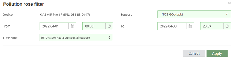
Figure 167 – Pollution rose analysis tool filter
It is possible to zoom in and out, as well
as modified the Pollution rose filter by clicking in the ![]() icons.
icons.
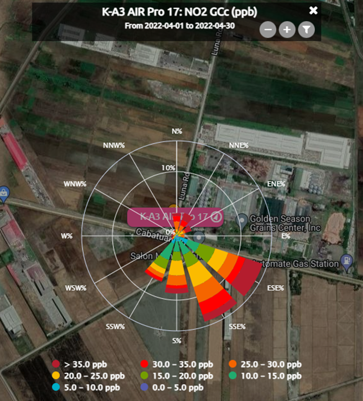
Figure 168 – Pollution rose analysis tool example
5.2.2.3 Particle analysis tool
The home dashboard for the air quality service offers an additional detailed particle tool. It is shown by clicking on the “PM tool” button of a marker’s bubble. It is only available if the device has a particle counter installed.
![]()
Figure 169 – Particle analysis tool button
This tool allows an analysis of the particles monitored by the particle sensor of Kunak Air devices over a certain period of time, showing the following results:
· Period average concentration: shows the mean concentrations of the different particle polluntants in the selected period.
· PM size distribution by mass: it represents the particle size distribution by mass concentration. The X axes shows thar average particle size, while the Y axes shows the concentration measured at each particle size.
· PM size distribution by counts: it representes the particle size distribution by number of particles or counts per volume (counts/cm3). The counts pero volume at each particle size is represented as bar graph, while the cumulative counts are represented as red line with dots.

Figure 170 – Particle analysis tool
5.3 Gas units
The devices will always calculates the gas concentration at ppb or ppm depending of the cartridge. After, at the cloud, the visualizations units can be changed to help with the interpretation of the data.
Depending of the unit selected at your account preferences (see 3.9.1.2 General preferences), you can see the cartridge data in:
· ppb or ppm (default)
· µg/m³ or mg/m³
Tow types of conversions factor can be selected:
· Preasure 1 atmosphere and temperature of 20 degrees Celsius (mostly used at Europe):
o O3: 1ppb = 1.9957 ug/m3
o NO: 1ppb = 1.247 ug/m3
o NO2: 1ppb = 1.9125 ug/m3
o NOx: 1ppb = 1.91 ug/m3
o CO: 1ppb = 1.1642 ug/m3
o CO_B: 1ppm = 1.1642 mg/m3
o SO2: 1ppb = 2.6609 ug/m3
o H2S: 1ppb = 1.418 ug/m3
o H2S_B: 1ppm = 1.418 mg/m3
o NH3: 1ppm = 0.708 mg/m3
o VOCs: 1ppm = 2.334 mg/m3 (Isobutylene)
o VOCs_B: 1ppm = 2.334 mg/m3 (Isobutylene)
· Preasure 1 atmosphere and temperature of 25 degrees Celsius (mostly used at EEUU):
o O3: 1ppb = 1.96 ug/m3
o NO: 1ppb = 1.226 ug/m3
o NO2: 1ppb = 1.88 ug/m3
o NOx: 1ppb = 1.88 ug/m3
o CO: 1ppb = 1.15 ug/m3
o CO_B: 1ppm = 1.15 mg/m3
o SO2: 1ppb = 2.62 ug/m3
o H2S: 1ppb = 1.394 ug/m3
o H2S_B: 1ppm = 1.394 mg/m3
o NH3: 1ppm = 0.696 mg/m3
o VOCs: 1ppm = 2.295 mg/m3 (Isobutylene)
o VOCs_B: 1ppm = 2.295 mg/m3 (Isobutylene)
5.4 Advanced AQI calendar plot
There is one extra plot for the air quality service: AQI calendar plot. It will be available in the “Data > Advanced” section provided that the Air quality service is enabled.


Figure 171 – AQI calendar plot
5.5 Air quality basic data statistics
This type of advanced graph is interesting to know the basic statistics and specifics air pollution statistics of the parameters of a device.
· Hourly aggregation:
o Mean, summation, max and min: hourly mean, summation, maximum value, and minimum value. Dedicated to normal sensors.
o Counter: the amount a counter increases every hour. Dedicated to sensors that are counters.
o Number of occurrences: number of 0 to 1 transition of a digital "Open/Close" sensor within an hour.
Example: Basic statistics of CO, NO2 and NO of a device located in the region of Navarra (Spain).

Figure 172 – Data > Advanced > Air quality basic statistics GOLD1: CO, NO2 and NO
The table shows the statistics in all period selected (August to October). The calculated statistics are as follows:
· Mean: period average
· Maximum: maximum hourly value
· Minimum: minimum hourly value
· Median: period median
· Maximum rolling eight-hourly mean: maximum eight-hourly rolling mean of all period
· Maximum rolling 24-hourly mean: maximum 24-hourly rolling mean of all period
· 95th and 99th percentile
· Number of days that the daily mean of PM10 is greater than 50 µg / m3
· Number of hours that hourly mean of NO2 is greater than 200 µg / m3
· Number of days that the eight-hourly mean of O3 is greater than 100 µg / m3
· Number of days that the eight-hourly mean of O3 is greater than 120 µg / m3
· AOT40: is the accumulated amount of ozone over the threshold value of 40 ppb for daylight hours in the growing season.
5.6 AQI sensors
Both in the “Data > Standard” and “Data > Advanced” sections, the sensors which are used to calculate the AQI will be available:

Figure 173 – Air quality service: new sensors available in “Data > Standard”

Figure 174 – Air quality service: sensors available in “Data > Advanced”
It is possible to analyse these sensors in the same way as the original ones. Since these sensors are used as partial calculations, they cannot be configured.